
NOTE: This page is from an older version, see the latest version here.
krpano XML Reference Version 1.18
krpano uses simple xml text files for storing the settings for the krpano viewer.
These files can be written or edited with any usual texteditor,
but when writting the xml code, it is important that the xml-syntax-rules will be respected!
For more information about the basic xml syntax, please have a look here:
 Basic XML Syntax Rules
For more information about the basic xml syntax, please have a look here:
Basic XML Syntax Rules
About this documentation
This documentation is about the krpano xml structure, about all krpano xml elements, attributes and values
and their mapping to their dynamic krpano variable names.
The documentation is split into normal and advanced parts. This is only for better readability and more clearness. The more advanced settings and tags are hidden by default and can be shown (or hidden) by pressing the button withhin each part of the documentation.
Documentation topics:
For the dynamic usage of the krpano variables and actions have a look at the:
Actions / Scripting Reference
krpano XML structure
Here a structured listing of all krpano xml elements: (click on an element to get more information)<krpano> <include> <preview> <image> <view> <area> <display> <control> <cursors> <autorotate> <plugin> <layer> <hotspot> <style> <events> <action> <contextmenu> <progress> <network> <memory> <security> <textstyle> <lensflareset> <lensflare> <data> <scene> </krpano>
- The root element of the xml file need to be the <krpano> element. All other elements must be placed inside this element.
- All xml elements and attributes in the krpano xml are optionally and can be defined a several times and in any order. When the same element will be defined again two or more times, then the later/following declarations will overwrite the previous ones.
- It's also possible to define additional <krpano> elements inside the root <krpano> element itself for declaring additional settings at the krpano scope.
- The xml itself is just a transport-format - that means it will be only used to transport the data for the krpano viewer. When the xml will parsed, then the xml elements will be transformed/mapped into the krpano internal data structures. That means after parsing there is internally no xml anymore.
NOTE - Some elements and attributes in the krpano xml were handled a special way:
- The name attribute:
When a xml element has a name attribute, then this element will be interpreted as element of an array. This means there can be more elements of that xml element, where each element need to have its own unique name for identification. The name of the array will be the name of the xml element.
Important notes about the name attribute:- Each name need to begin with an alphabetic character!
- That means using a number as name is NOT allowed!
- When a name still begins with a numeric character, then the name will be interpreted as array index. This is okay for dynamic index-based read access inside actions but not for defining elements!
- All names will be converted automatically to lower case to allow case insensitive access!
-
The devices attribute:
The devices attribute defines if the given xml element and all its sub/children elements should be used or skipped on a given device. The resolving of the devices attributes happens during the xml loading and parsing.
Syntax:- The value of the devices attribute can be one or more of the available devices strings.
- Several devices can be combined by using these logical operators:
- A plus + character or the string .and. can be used as AND operator to check if all devices settings are matching
- A pipe | character or the string .or. can be used as OR operator to check if one of the given devices settings is matching
- An exclamation mark ! character or a no- prefix before a devices setting can be used to check if the given devices setting is NOT set
- Resolving order: The AND checks will be resolved before the OR checks.
Note - for checking for the devices settings dynamically in actions code, use the device object and the if() or resolvecondition() actions.Available devices:- flash - use this element only in the krpano Flash viewer
- html5 - use this element only in the krpano HTML5 viewer
- desktop - use this element only on Desktop
- mobile - use this element only on Mobiles
- tablet - use this element only on Tablets
- Note - desktop, mobile and tablet are 'tri-state' settings, they can never be set at the same time, only one of these can be set.
- css3d - use this element only when CSS-3D-Transforms are available (HTML5 only)
- webgl - use this element only when WebGL is available (HTML5 only)
- multiressupport - use this element only when the browser is capable for multires
- panovideosupport - use this element only when the browser is capable for panoramic video
- fullscreensupport - use this element only when the Fullscreen mode is support
- mouse - use this element only on devices with mouse support
- touch - use this element only on devices with Multi-Touch support
- Note - mouse and touch can be set at the same time when the device is supporting both (e.g. desktop devices with touch-screens).
- ios - use this element only on iOS devices (iPhone, iPod, iPad)
- ios### - use this element only when the iOS version is equal or higher than ###
- iphone - use this element only on the iPhone (and iPod Touch)
- ipod - use this element only on the iPod Touch
- ipad - use this element only on the iPad
- retina - use this element only on iOS retina displays
- android - use this element only on Android devices
- androidstock - use this element only in the 'stock' (=WebView-based) Android browser
- blackberry - use this element only on BlackBerry devices
- chrome - use this element only in the Chrome browser (HTML5 only)
- firefox - use this element only in the Firefox browser (HTML5 only)
- ie - use this element only in the Internet Explorer browser (HTML5 only)
- safari - use this element only in the Safari browser (HTML5 only)
- opera - use this element only in the (Presto-based) Opera browser (HTML5 only)
- air - use this element only in the Adobe AIR Player
- standalone - use this element only in the Standalone Flashplayer
- windows - use this element only on Windows systems
- mac - use this element only on Mac OSX systems
- linux - use this element only on Linux systems
 Examples
devices="html5"
devices="flash"
devices="desktop"
devices="mobile"
devices="tablet"devices="ios"
devices="android"devices="ios8.0" = iOS 8.0 or higher
devices="androidstock" = older android devicesdevices="flash|webgl" = systems with fisheye-distortion support
devices="flash.or.webgl" (new syntax)
-
Add device checks for attributes: (attributes with a dot in their name)
By adding a dot . character at the end of an attribute name and then there the names of one or more devices settings, it is possible to define that attribute only for that given devices.
Syntax:- Everything before the first dot belongs to the name of the attribute itself and everything after the first dot belongs to the device check.
- All the same devices as in the devices attribute can be used for the device checks.
- Mixing several devices via logical AND, OR and NOT operators is possible too, but because of the xml-character-limitations with a slightly limited syntax:
- An .and. can be used as AND operator to check if all given devices settings are matching (like the + character in the devices attribute).
- An .or. can be used as OR operator to check if one of the given devices settings is matching (like the | character in the devices attribute).
- A no- prefix before a devices setting can be used to check if the given devices setting is NOT set (like the ! character in the devices attribute).
- Resolving order: The AND checks will be resolved before the OR checks.
-
Important to know: The order of xml-attributes is random and can differ each time!
That means the order how the attributes were defined in the xml file don't need to be the same how they will be get loaded/parsed.
Therefore never redefine attributes again other devices settings that would override previous definitions.!
Examplesscale.no-mobile="1.0" (the same as: scale.desktop.or.tablet="1.0")
scale.mobile="0.5"url.flash="plugin.swf"
url.html5="plugin.js"videourl.desktop="video-high-profile.mp4"
videourl.mobile.or.tablet="video-baseline-profile.mp4"width.desktop="200"
width.tablet="150"
width.mobile="100"visible.fullscreensupport="true"
visible.no-fullscreensupport="false"visible.html5.and.webgl.or.flash="true"
visible.html5.and.no-webgl="false"
- The <include> element:
The <include> elements can be used to load and include other xml files. Before the krpano viewer will start to parse and resolve a xml file, it searches the xml for all include elements. And when a include element will be found, then the given xml will be loaded and the content of the loaded xml file will insert in the current xml file by and replacing the include element.
During this include loading and resolving process,the url attributes in the included xml files will be adjusted. See the notes about the url attribute for more details.
When all includes were loaded and resolved, then the main xml parsing starts. - The <action> / <data> / <scene> elements:
These are special elements, their content will be ignored during the xml parsing. Their whole content will be stored as string in the content variable of these elements.
- The url attribute
An url attribute in any xml element will be handled in krpano in a special way.
When a relative path is used as url value, it will be relative to the xml file, where the url attribute was defined. This is also true for included xml files. That means relative paths in an included xml are relative to the included xml file itself and not to the main/root xml file.
Note - when setting / changing the url attribute dynamically, then there is no automatic relation to the xml file paths anymore!
To make the path relative to some special predefined paths, it's possible to use some of these placeholders in the url path:
- %FIRSTXML% - Path of the first loaded xml file.
- %CURRENTXML% - Path of the current loaded main xml file (not the included one).
- %SWFPATH% - Path of the swf file.
- %HTMLPATH% - Path of the html file.
- %BASEDIR% - Use the basedir path.
- %$VARIABLE% - Use the value of the given 'VARIABLE' - this can be any krpano variable, but it must be defined before the current xml or scene will be loaded, e.g. already in the html file or before loadpano(), loadscene() calls.
XML elements / attributes / values / variables
Here detail documentations about the krpano xml elements:
<krpano>
This is the main / root element of a krpano xml file.
All further xml elements need to be defined within this element.
Advanced notes - when the xml gets parsed and resolved into the data structures the leading 'krpano' tag will be stripped away. This makes it possible to define another <krpano> elements inside the current one to define or redefine settings from the previous definition.
Examples
All further xml elements need to be defined within this element.
Advanced notes - when the xml gets parsed and resolved into the data structures the leading 'krpano' tag will be stripped away. This makes it possible to define another <krpano> elements inside the current one to define or redefine settings from the previous definition.
<krpano version="1.18"
        onstart=""
        basedir="%FIRSTXML%"
        bgcolor=""
        idletime="0.5"
        colorcorrection="default"
        logkey="true"
        showerrors="true"
        debugmode="false"
    >
    ...
</krpano>
| Attribute name | Full variable name | Type | Default value |
| version | xmlversion | String | "1.18" |
|---|---|---|---|
| Information about the krpano version that was used for creating the xml file. This is mainly only an information for orientation, but it should be still defined to allow handling potential compatibility-related version changes. | |||
| Attribute name / Full variable name | Type | Default value | |
| onstart | Action Event | ||
| The onstart event will be called directly at the start after the xml loading and parsing. | |||
| Attribute name / Full variable name | Type | Default value | |
| basedir | String | "%FIRSTXML%" | |
|
The basedir setting defines the base directory for all following loadpano() action calls. This can be a relative or an absolute path and it's also possible to use the url placeholders here. The defaultvalue is %FIRSTXML% and that means that all relative xml paths of all following loadpano() action calls are relative to the first loaded xml file. |
|||
| Attribute name / Full variable name | Type | Default value | |
| bgcolor | String | ||
The viewer background color.
That background color can be only seen before a pano image will be loaded or when
using partial panos / flat images that are not covering the full view.
|
|||
| Attribute name / Full variable name | Type | Default value | |
| idletime | Number | 0.5 | |
| The time in seconds without any user interaction before calling the idle event. | |||
| Attribute name / Full variable name (Flash only) | Type | Default value | |
| colorcorrection | String | "default" | |
|
Change the color correction settings of the Flashplayer. See here for more details: Flashplayer10 colorCorrection Possible settings: "default", "on", "off" Warning - there can be performance degrades when set to "on" ! |
|||
| Attribute name / Full variable name | Type | Default value | |
| logkey | Boolean | true | |
| Enable/disable the 'O' keyboard key, which switches the Output / log window on / off. Note - this parameter will be only checked once at startup! | |||
| Attribute name / Full variable name | Type | Default value | |
| showerrors | Boolean | true | |
| Should the output/trace log window open automatically when an error happens to show the error message. | |||
| Attribute name / Full variable name | Type | Default value | |
| debugmode | Boolean | false | |
| Should the debug trace messages from krpano or from plugins be shown. | |||
Examples<krpano version="1.18" onstart="loadscene(scene1);"> <scene name="scene1"> ... </scene> </krpano>
<include>
Include other xml files.
The <include> elements will be resolved during the xml loading. The <include> element in the current xml will be replaced with the loaded content of the included xml file. Once all include elements are resolved, the viewer will start to parse the loaded xml data and convert / map it to the runtime data structures.
Examples
The <include> elements will be resolved during the xml loading. The <include> element in the current xml will be replaced with the loaded content of the included xml file. Once all include elements are resolved, the viewer will start to parse the loaded xml data and convert / map it to the runtime data structures.
<include url="path/name.xml" />
| Attribute name | Type | ||
| url | String | ||
|---|---|---|---|
|
The url / path of the xml file that should be included. Relative urls path will be automatically adjusted to be relative to the xml file in which they will be defined. See also the notes about the url attribute for more details. |
|||
Examples<include url="settings.xml" />
<include url="skin/skin.xml" />
<include url="%SWFPATH%/global.xml" />
<preview>
Define the url / filename to a small 'preview' panorama image that will be displayed while loading the full pano image.
This preview image should should be small (in filesize and image dimensions) to allow fast loading!
Note - For best rendering quality and performance the usage of cubestrip images will be recommended! High quality preview images (smoothed along all edges and all directions) can be easily created by using the krpano tools.
Examples
DEMO: view some preview examples interactive
Note - For best rendering quality and performance the usage of cubestrip images will be recommended! High quality preview images (smoothed along all edges and all directions) can be easily created by using the krpano tools.
<preview type=""
         url="previewpano.jpg"
         striporder="LFRBUD"
         details="16"
         />
| Attribute name | Full variable name | Type | Default value |
| type | preview.type | String | |
|---|---|---|---|
|
Set the panoramic type of the preview image. Possible settings:
When the main <image> is a partial pano, then the preview pano will use automatically the same hfov / vfov / voffset settings. |
|||
| Attribute name | Full variable name | Type | Default value |
| url | preview.url | String | |
|
The url / path to the preview image. This can be a spherical, cylindrical or a cubestrip (1x6, 6x1, 3x2 or 2x3) image. When the main <image> is a partial pano, then the preview pano will use automatically the same hfov / vfov / voffset settings. |
|||
| Attribute name | Full variable name | Type | Default value |
| striporder | preview.striporder | String | "LFRBUD" |
| Defines the order of the images in the cubestrip image. | |||
| Attribute name | Full variable name (Flash only) | Type | Default value |
| details | preview.details | int | 16 |
| Internal rendering tessellation details, a higher details value will result in a more detailed internal 3D-geometry. When using the Flashplayer 10 and cubical images without any distortion (fisheye, stereographic, ...) then this setting will be ignored, because a tessellation will be no necessary. | |||
Examples<preview url="pano_preview.jpg" />
<preview type="grid(CUBE,16,16,512,0xCCCCCC,0xFFFFFF,0x999999);" />
<preview type="SPHERE" url="spherepreview.jpg" />
<preview type="CUBESTRIP" url="cspreview.jpg" />
DEMO: view some preview examples interactive
<image>
With the <image> element the pano image will be defined.
Set here the type, the sizes and the url paths to the images / tiles.
Set here the type, the sizes and the url paths to the images / tiles.
<image type="CUBE" prealign="" type="CUBE"
       multires="true"
       multiresthreshold="0.025"
       progressive="true"
       tilesize="..."
       baseindex="1"
       frames="1"
       frame="1"
       prealign=""
 >
  <level tiledimagewidth="..."
         tiledimageheight="..."
         tilesize=""
         details=""
         download="auto" decode="auto"
         aspreview="false"
   >
    <cube url="pano_%s_%v_%h.jpg" />
  </level>
  <level ...>
    ...
  </level>
  ...
</image>
| Attribute name | Full variable name | Type | Default value |
| type | image.type | String | |
|---|---|---|---|
|
Define the type of the panorama image. Possible values:
|
|||
| Attribute name | Full variable name | Type | Default value |
| hfov | image.hfov | Number | |
|
Defines the horizontal field of view (hfov) of the pano image in degrees. This is the visible range that was captured on the pano image. The default value will be 360, which means a view all around. Use a smaller value for partial panos. For Flat panos (or normal images) the value "1.0" should be used. |
|||
| Attribute name | Full variable name | Type | Default value |
| vfov | image.vfov | Number | |
|
Defines the vertical field of view (vfov) of the pano image in degrees. By default (when no value was set), this value will be calculated automatically by using the hfov, the type of the pano and the side aspect of the pano image. |
|||
| Attribute name | Full variable name | Type | Default value |
| voffset | image.voffset | Number | 0.0 |
|
Defines the vertical offset of the pano image in degrees. By default the pano image will be centered in the 3D space. This means the viewing range will be from -hfov/2 to +hfov/2 and from -vfov/2 to +vfov/2. Now when using a partial pano image where the horizon is not in the middle of image (not at 0 degree), then this image will be displayed distorted. The voffset can be used to shift the fov range up or down to center the image correctly in the 3D space. How to get the correct voffset value: When the vertical range of the pano image is known, then it can be calculated: voffset = (vfov_min + vfov_max) / 2 e.g. for a 240x100 pano with the fov from -75 to +25: vfov_min = -75 vfov_max = +25 voffset = (-75 + 25) / 2 = -25or see the result for a 360x180 pano with -90 to +90: vfov_min = -90 vfov_max = +90 voffset = (-90 + 90) / 2 = 0.0 When the vertical range is unknown - just try out some values (negative and positive ones in the range from -90 to +90). Additionally it can be helpful here to set <view limitview="off" />in the xml to allow viewing the whole partial image without viewing limitations. |
|||
| Attribute name | Full variable name | Type | Default value |
| tilesize | image.tilesize | int | |
| Define the tilesize for multires images. | |||
| Attribute name | Full variable name | Type | Default value |
| baseindex | image.baseindex | int | 1 |
| The index base (numbering start) for the tile indicies. | |||
| Attribute name | Full variable name | Type | Default value |
| multires | image.multires | Boolean | false |
|
Enables the usage of tiled multi-resolution images. When set to true, then the <image> element need to contain several <level> elements with the image definitions for each multi-resolution level. |
|||
| Attribute name | Full variable name | Type | Default value |
| multiresthreshold | image.multiresthreshold | Number | 0.025 |
| The multiresthreshold value controls, depending on the fov/zoom, when to switch from one multi-resolution level to the next one. Suitable values are from -1.0 to +1.0. When there is too much aliasing, try negative values like -0.5. | |||
| Attribute name | Full variable name (Flash only) | Type | Default value |
| progressive | image.progressive | Boolean | false |
|
Enables or disables progressive multi-resolution loading. Progressive loading means that the multi-resolution pano will be loaded step by step from low to high resolution. Only the tiles in the current viewing range will be loaded from level level. When disabled, then the tiles for current resolution will be loaded at first, and then when the loading of all current visible tiles was done, it will start preloading the lower resolutions of the current view. |
|||
| Attribute name | Full variable name | Type | Default value |
| prealign | image.prealign | String | |
|
With the prealign setting the pano image itself can be aligned / rotated. This can be used to correct a miss-aligned pano. The syntax: prealign="X|Y|Z"where X, Y, Z defines the rotation about these axis in degrees. Dynamically changing the prealign setting is possible, but requires a updateobject(true,true) action call to update the image. |
|||
| Attribute name | Full variable name (Flash only) | Type | Default value |
| frames frame |
image.frames image.frame |
int int |
1 1 |
|
Current frame and number of frames of the pano. It's possible to use several frames for a pano image, there the %f placeholder must be used in the image urls. That placeholder will be replaced with the current set frame number. |
|||
| Full variable name (as3 usage only) | Type | Default value | |
| image.layer | Sprite | ||
|
Actionscript 3 Sprite object of the pano image layer. |
|||
| Attribute name | Full variable name | Type | Default value |
| cube.url | image.cube.url | String | |
|
Define the paths / urls for a cubical pano image. The path should contain a %s placeholder for the cube side (l,f,r,b,u,d). |
|||
| Attribute name | Full variable name | Type | Default value |
| left.url front.url right.url back.url up.url down.url |
image.left.url image.front.url image.right.url image.back.url image.up.url image.down.url |
String String String String String String |
|
|
Define the paths / urls for the cubeface images. Note - see also the notes about the tile index placeholders - tile placeholders |
|||
| Attribute name | Full variable name (Flash only) | Type | Default value |
| left.strip front.strip right.strip back.strip up.strip down.strip |
image.left.strip image.front.strip image.right.strip image.back.strip image.up.strip image.down.strip |
int int int int int int |
0 1 2 3 4 5 |
| For cubestrip panos - define which image part / strip of the cubestrip is the image for the cubeface. | |||
| Attribute name | Full variable name (Flash only) | Type | Default value |
| left.rotate front.rotate right.rotate back.rotate up.rotate down.rotate |
image.left.rotate image.front.rotate image.right.rotate image.back.rotate image.up.rotate image.down.rotate |
int int int int int int |
0 0 0 0 0 0 |
|
Rotate a cube side in degrees. Can be used for cube images in non krpano default configurations. |
|||
| Attribute name | Full variable name (Flash only) | Type | Default value |
| left.flip front.flip right.flip back.flip up.flip down.flip |
image.left.flip image.front.flip image.right.flip image.back.flip image.up.flip image.down.flip |
String String String String String String |
|
|
Flip / mirror the image along the X and/or Y axis. Possible values: "X" or "Y" or "XY" or "", default="" |
|||
| Attribute name | Full variable name | Type | Default value |
| cubestrip.url | image.cubestrip.url | String | |
|
Define the path / url for a cubestrip image. |
|||
| Attribute name | Full variable name | Type | Default value |
| sphere.url | image.sphere.url | String | |
|
Define the path / url for a spherical or partial spherical pano image. Note - see also the notes about the tile index placeholders - tile placeholders |
|||
| Attribute name | Full variable name | Type | Default value |
| cylinder.url | image.cylinder.url | String | |
|
Define the path / url for a cylindrical or partial cylindrical pano image. Note - see also the notes about the tile index placeholders - tile placeholders |
|||
| Full variable name (read only) | Type | Default value | |
| image.level.count | int | 0 | |
| The count / number of all image level elements. | |||
| Attribute name | Full variable name | Type | Default value |
| level[..].tiledimagewidth level[..].tiledimageheight | image.level[..].tiledimagewidth image.level[..].tiledimageheight | int int |
|
| The full / total size of the tiled image for this level. | |||
| Attribute name | Full variable name | Type | Default value |
| level[..].tilesize | image.level[..].tilesize | int | |
| This setting will overrule the main image.tilesize setting for this level. | |||
| Attribute name | Full variable name (Flash only) | Type | Default value |
| level[..].download level[..].decode |
image.level[..].download image.level[..].decode |
String String |
"auto" "auto" |
|
Defines if the all tiles from that level should be downloaded and decoded or only the onces
that were currently need for viewing. Possible values: "all", "view" or "auto"
|
|||
| Attribute name | Full variable name (Flash only) | Type | Default value |
| level[..].details | image.level[..].details | int | |
| This setting will overrule the default display.details setting. | |||
| Attribute name | Full variable name | Type | Default value |
| level[..].aspreview | image.level[..].aspreview | Boolean | false |
|
Use this level as preview image. This also forces the whole level to be fully loaded. |
|||
| Attribute name | Full variable name | Type | Default value |
| level[..].left.url level[..].front.url level[..].right.url level[..].back.url level[..].up.url level[..].down.url |
image.level[..].left.url image.level[..].front.url image.level[..].right.url image.level[..].back.url image.level[..].up.url image.level[..].down.url |
String String String String String String |
|
|
Define the paths / urls for the cube face images for this level. Note - see also the notes about the tile index placeholders - tile placeholders |
|||
| Attribute name | Full variable name | Type | Default value |
| level[..].sphere.url | image.level[..].sphere.url | String | |
|
Define the path / url for a spherical or partial spherical pano image for this level. Note - see also the notes about the tile index placeholders - tile placeholders |
|||
| Attribute name | Full variable name | Type | Default value |
| level[..].cylinder.url | image.level[..].cylinder.url | String | |
|
Define the path / url for a cylindrical or partial cylindrical pano image for this level. Note - see also the notes about the tile index placeholders - tile placeholders |
|||
About the url placeholders for tiled multi-resolution images
When using multi-resolution images, then the urls / paths must contain placeholders for the tile index.
The tile index number itself starts with the baseindex.
There are these placeholder available:
The index numbers can be additionally formated by putting one or more 0 characters between the % and the placeholder character - each 0 will increase the 0 padding of the index number.
Here some examples:
There are these placeholder available:
- for the horizontal tile index: %h, %x, %u or %c (all the same)
- for the vertical tile index: %v, %y or %r (all the same)
- for the current frame: %f
The index numbers can be additionally formated by putting one or more 0 characters between the % and the placeholder character - each 0 will increase the 0 padding of the index number.
Here some examples:
tile_%y_%x.jpg
- tile_1_1.jpg
- tile_1_2.jpg
- ...
- tile_8_16.jpg
tile_%0y_%0x.jpg
- tile_01_01.jpg
- tile_01_02.jpg
- ...
- tile_08_16.jpg
tile_%00V_%00H.jpg
- tile_001_001.jpg
- tile_001_002.jpg
- ...
- tile_008_016.jpg
<view>
The view element contains the information about the current view.
In the xml it can be used to set the startup view settings.
The looking direction will be defined by the hlookat / vlookat attributes (=horizontal / vertical lookat), and the current field of view in the fov attribute. For viewing limits for partial panos, the limitview attribute can be used.
Examples
The looking direction will be defined by the hlookat / vlookat attributes (=horizontal / vertical lookat), and the current field of view in the fov attribute. For viewing limits for partial panos, the limitview attribute can be used.
<view hlookat="0.0"
      vlookat="0.0"
      camroll="0.0"
      fovtype="VFOV"
      fov="90.0"
      fovmin="1.0"
      fovmax="179.0"
      maxpixelzoom=""
      mfovratio="1.333333"
      fisheye="0.0"
      fisheyefovlink="0.5"
      stereographic="false"
      pannini="0.0"
      architectural="0.0"
      architecturalonlymiddle="false"
      limitview="auto"
      hlookatmin=""
      hlookatmax=""
      vlookatmin=""
      vlookatmax=""
      />
| Attribute name | Full variable name | Type | Default value |
| hlookat | view.hlookat | Number | 0.0 |
|---|---|---|---|
|
The horizontal looking direction in spherical coordinates in degrees. The typical range is from -180° to +180°. The value will not wrap around 360° but the view itself will. The value 0.0 points to the center of the pano image. |
|||
| Attribute name | Full variable name | Type | Default value |
| vlookat | view.vlookat | Number | 0.0 |
|
The veritcal looking direction in spherical coordinates in degrees. The typical range is from -90° upward at the zenith down to +90° at the nadir. |
|||
| Attribute name | Full variable name | Type | Default value |
| camroll | view.camroll | Number | 0.0 |
|
The roll / rotation of the view camera in degrees. See also: control.camrollreset |
|||
| Attribute name | Full variable name | Type | Default value |
| fovtype | view.fovtype | String | VFOV |
|
Defines the type of the field of view that the fov value represents. Possible settings:
|
|||
| Attribute name | Full variable name | Type | Default value |
| fov | view.fov | Number | 90.0 |
| The current field of view in degrees - from almost 0.0 to 179.0. | |||
| Attribute name | Full variable name (read only) | Type | Default value |
| hfov vfov |
view.hfov view.vfov |
Number Number |
|
|
The current horizonal and vertical fov values. Can values are read-only and can be used only for dynamically checking the current field of view coverage. |
|||
| Attribute name | Full variable name | Type | Default value |
| fovmin | view.fovmin | Number | 1.0 |
|
The minimum fov value, this will limit the zooming into the pano. Note - maxpixelzoom setting can be used instead! |
|||
| Attribute name | Full variable name | Type | Default value |
| fovmax | view.fovmax | Number | 179.0 |
|
The maximum fov value, this will limit zooming out of the pano. |
|||
| Attribute name | Full variable name | Type | Default value |
| maxpixelzoom | view.maxpixelzoom | Number | |
|
The maximum pixel zoom factor of the pano image. This will limit the fov automatically depending on the pano resolution and the current viewing window, e.g. 1.0 = limit to 100% zoom, no pixel scaling of the source image will be visible. Note - when set, this setting will overrule the fovmin setting, the fovmin value will be dynamically updated in this case. |
|||
| Attribute name | Full variable name | Type | Default value |
| mfovratio | view.mfovratio | Number | 1.333333 |
| The size ratio for the maximum screen size calculation when using the fovtype=MFOV setting. By default the ratio of a 4:3 screen (4/3 = 1.333) will be used. | |||
| Attribute name | Full variable name | Type | Default value |
| fisheye | view.fisheye | Number | 0.0 |
|
Fisheye distortion effect (0.0 - 1.0) This value contolls the interpolation between the normal rectiliniear view and the fisheye distorted view. 0.0 = no distortion / rectiliniear 1.0 = full distortion There are two fisheye modes: - normal (view.stereographic="false") - stereographic (view.stereographic="true") |
|||
| Attribute name | Full variable name | Type | Default value |
| fisheyefovlink | view.fisheyefovlink | Number | 0.5 |
|
The fov and fisheye settings are linked together (when zooming in - the fisheye effect will be reduced)
this value is the correlation between these values: (0.0 - 3.0), 0=linear correlation, 3=dynamic correlation) - default="0.5" |
|||
| Attribute name | Full variable name | Type | Default value |
| stereographic | view.stereographic | Boolean | true |
|
Enables/disables the stereographic fisheye projection. The 'strongness' of the projection it is controlled by the fisheye setting. The stereographic projection allowes very interessting panorama views like the Little Planet Views. |
|||
| Attribute name | Full variable name | Type | Default value |
| pannini | view.pannini | Number | 0.0 |
|
Apply a Pannini/Vedutismo projection (0.0 to 1.0). The 'strongness' of the projection it is controlled by the fisheye setting. |
|||
| Attribute name | Full variable name | Type | Default value |
| architectural | view.architectural | Number | 0.0 |
|
Architectural projection (0.0 - 1.0). This value interpolates between the current projection (0.0) and the architectural projection mode (1.0). |
|||
| Attribute name | Full variable name | Type | Default value |
| architecturalonlymiddle | view.architecturalonlymiddle | Boolean | false |
| When enabled, the architectural projection will be only used in the 'middle' area of the pano. When looking more up and down then the architectural projection will slowly switch back to normal projection. | |||
| Attribute name | Full variable name | Type | Default value |
| limitview | view.limitview | String | auto |
|
Limit the viewing range in the pano. Possible values:
when the "hlookatmin", "hlookatmax", "vlookatmin", "vlookatmax" values were not set, they will be automatically calculated from the size of the pano image. |
|||
| Attribute name | Full variable name | Type | Default value |
| hlookatmin hlookatmax vlookatmin vlookatmax |
view.hlookatmin view.hlookatmax view.vlookatmin view.vlookatmax |
Number Number Number Number |
|
|
The minimum horizontal looking position in spherical coordinates (-180 .. +180). The maximum horizontal looking position in spherical coordinates (-180 .. +180). (When hlookatmax-hlookatmin=360 then no limiting will be done) The minimum vertical looking position in spherical coordinates (-90 .. +90). The maximum vertical looking position in spherical coordinates (-90 .. +90). |
|||
| Attribute name | Full variable name (read only) | Type | Default value |
| hlookatrange vlookatrange |
view.hlookatrange view.vlookatrange |
Number Number |
|
|
The current maximum horizontal looking range (same as hlookatmax - hlookatmin). The current maximum vertical looking range (same as vlookatmax - vlookatmin). |
|||
Examples
normal:
little planet view:
flat pano:
<view hlookat="0" vlookat="0" fov="80" />
little planet view:
<view hlookat="0"
      vlookat="90"
      fisheye="1.0"
      stereographic="true"
      fov="150"
      fovmax="150"
      />
flat pano:
<view hlookat="0"
      vlookat="0"
      maxpixelzoom="1.0"
      limitview="fullrange"
      />
<area>
Defines the area / window where in the pano image should be displayed.
There are two modes to define the area position and size:
It's possible to change/adjust these settings dynamically in the onresize event. When there are changes of the area settings outside of the onresize event, then a onresize event will be called on the next screen refresh, to allow a reaction on the next area/window size.
Note - all <layer> or <plugin> elements will be placed inside this area. To place a <layer> or <plugin> element outside that area, set the parent attribute of that layer / plugin element to "STAGE".
Examples
There are two modes to define the area position and size:
- either by defining the size and the position (mode=align).
- or by defining padding borders (mode=border).
It's possible to change/adjust these settings dynamically in the onresize event. When there are changes of the area settings outside of the onresize event, then a onresize event will be called on the next screen refresh, to allow a reaction on the next area/window size.
Note - all <layer> or <plugin> elements will be placed inside this area. To place a <layer> or <plugin> element outside that area, set the parent attribute of that layer / plugin element to "STAGE".
| Attribute name | Full variable name | Type | Default value |
| mode | area.mode | String | "align" |
|---|---|---|---|
|
Select the area positioning / sizing mode. Possible settings: "align" or "border". Align mode: <area mode="align" align="lefttop" x="0" y="0" width="100%" height="100%" /> Border padding mode: <area mode="border" left="0" top="0" right="0" bottom="0" /> |
|||
| Attribute name | Full variable name | Type | Default value |
| align | area.align | String | "lefttop" |
|
Alignment / origin-point position of the area window on the screen. Possible values: lefttop, left, leftbottom, top, center, bottom, righttop, right, rightbottom. |
|||
| Attribute name | Full variable name | Type | Default value |
| x y |
area.x area.y |
String String |
"0" "0" |
|
The x / y distance from the align point to the area window (only for mode=align). This can be either an absolute pixel values or a percent values that are relative to the screen width / height. |
|||
| Attribute name | Full variable name | Type | Default value |
| width height |
area.width area.height |
String String |
"100%" "100%" |
|
The width / height of the area (only for mode=align). This can be either an absolute pixel values or a percent values that are relative to the screen width / height. |
|||
| Attribute name | Full variable name | Type | Default value |
| left top right bottom |
area.left area.top area.right area.bottom |
String String String String |
"0" "0" "0" "0" |
|
The distances from the left / top / right / bottom edges of the screen to the area window (only for mode=border). This can be either an absolute pixel values or a percent values that are relative to the screen width / height. |
|||
| Full variable name (read only) | Type | Default value | |
|
area.pixelx area.pixely area.pixelwidth area.pixelheight |
int int int int |
||
|
The resulting area position (from left-top) and size in pixels (read-only). |
|||
Examples
A fixed size area in the center of screen:
Fixed size borders at top and bottom:
Use only 75% of the available width:
Use the area dynamically to set a fixed 16:9 aspect:
<area align="center" width="640" height="480" />
Fixed size borders at top and bottom:
<area mode="border" top="10" bottom="100" />
Use only 75% of the available width:
<area x="25%" width="75%" />
Use the area dynamically to set a fixed 16:9 aspect:
<events onresize="fixaspectresize(16,9);" />

<action name="fixaspectresize">
  div(aspect,%1,%2);
  mul(destwidth,  stagewidth, aspect);
  copy(destheight, stagewidth);
  if(destwidth GT stagewidth,
     div(dwnscale,stagewidth,destwidth), set(dwnscale,1.0)
    );
  mul(destwidth,  dwnscale);
  mul(destheight, dwnscale);
  if(destheight GT stageheight,
     div(dwnscale,stageheight,destheight), set(dwnscale,1.0)
    );
  mul(destwidth,  dwnscale);
  mul(destheight, dwnscale);
  sub(destx, stagewidth,  destwidth);
  sub(desty, stageheight, destheight);
  mul(destx, 0.5);
  mul(desty, 0.5);
  copy(area.x,      destx);
  copy(area.y,      desty);
  copy(area.width,  destwidth);
  copy(area.height, destheight);
</action>
<display>
Display settings for adjusting rendering quality and performance.
Flashplayer-related display settings:
HTML5-related display settings:
* HIGHSHARP: after rendering the pano in HIGH quality, the image will be additionally postprocessed with a 1 pixel unsharp-mask filter, this setting needs a lot of processing power so it should be only used for stillquality.
Examples
Mipmapping Screenshots:

Flashplayer-related display settings:
<display fps="60"
         details="24"
         tessmode="-1"
         movequality="LOW"
         stillquality="HIGH"
         flash10="on"
         movequality10="BEST"
         stillquality10="BEST"
         sharpen="12"
         stilltime="0.25"
         showpolys="false"
         />
HTML5-related display settings:
<display hardwarelimit=""
         usedesktopimages=""
         mipmapping="auto"
         loadwhilemoving="auto"
         />
| Attribute name | Full variable name (Flash only) | Type | Default value |
| fps | display.fps | int | 60 |
|---|---|---|---|
|
The framerate in frames per second (fps) of the Flashplayer. It should be something between 30 and 100, the default is 60. Note - in the Flashplayer there is only one global framerate, this means the framerate setting can affect other flash elements when their animation is based on the framerate. |
|||
| Full variable name (read only) | Type | Default value | |
| display.currentfps | Number | ||
| The current average framerate. | |||
| Full variable name (read only) | Type | Default value | |
| display.frame | int | ||
| The current frame number. | |||
| Attribute name | Full variable name (Flash only) | Type | Default value |
| details | display.details | int | 24 |
| Internal rendering tesslation details, a higher details value will result in a more detailed internal 3D-geometry. When using the Flashplayer 10 and cubical images without any distortion (fisheye, stereographic, ...) then this setting will be ignored, because a tesslation will be no necessary. | |||
| Attribute name | Full variable name (Flash only) | Type | Default value |
| tessmode | display.tessmode | int | -1 |
|
The tesslation mode / the arrangement of the internal triangles, 1-5 or -1 (=automatic) -1 means 0 for spheres and 3 for cubes. |
|||
| Attribute name | Full variable name (Flash only) | Type | Default value |
| movequality | display.movequality | String | "LOW" |
|
The Flashplayer rendering quality while moving. (only with flash10="off" or when using the Flashplayer 9) Possible values: LOW, HIGH, BEST or HIGHSHARP* |
|||
| Attribute name | Full variable name (Flash only) | Type | Default value |
| stillquality | display.stillquality | String | "HIGH" |
|
The Flashplayer rendering quality when not moving for
stilltime seconds. (only with flash10="off" or when using the Flashplayer 9) Possible values: LOW, HIGH, BEST or HIGHSHARP* |
|||
| Attribute name | Full variable name (Flash only) | Type | Default value |
| flash10 | display.flash10 | String | "on" |
|
Enable/disable the usage of the Flashplayer 10 rendering possibilities. Possible values: "on", "off" Since the Flashplayer 10 there are new rendering functions in the Flashplayer avialable. This functions allow to render flat surfaces (bitmaps) with a perfect 3D perspective distortion. In the older Flashplayer 9 on the other side, it was only possible to simulate the 3D perspective distortion bytesslating/spliting the 3D model into many small elements and draw the small elements without perspective distortion. The new functions have advantages and disadvantages:
|
|||
| Attribute name | Full variable name (Flash only) | Type | Default value |
| movequality10 | display.movequality10 | String | "BEST" |
|
The Flashplayer rendering quality while moving. (only with flash10="on" and using a Flashplayer 10 or higher) Possible values: LOW, HIGH, BEST or HIGHSHARP* |
|||
| Attribute name | Full variable name (Flash only) | Type | Default value |
| stillquality10 | display.stillquality10 | String | "BEST" |
|
The Flashplayer rendering quality when not moving for stilltime seconds. (only with flash10="on" and using a Flashplayer 10 or higher) Possible values: LOW, HIGH, BEST or HIGHSHARP* |
|||
| Attribute name | Full variable name (Flash only) | Type | Default value |
| sharpen | display.sharpen | int | 12 |
| When the rendering quality is set to HIGHSHARP then the rendered image will be sharpened as post-process. With the sharpen setting it is possible to control the strength of that sharpen effect. Possible values are from 0 to 14. | |||
| Attribute name | Full variable name (Flash only) | Type | Default value |
| stilltime | display.stilltime | Number | 0.25 |
| The time in seconds after last movement in the pano before swtiching from movequality(10) to stillquality(10). | |||
| Attribute name | Full variable name (Flash only) | Type | Default value |
| showpolys | display.showpolys | Boolean | false |
| Show the polygons of the internal 3D geometry. | |||
* HIGHSHARP: after rendering the pano in HIGH quality, the image will be additionally postprocessed with a 1 pixel unsharp-mask filter, this setting needs a lot of processing power so it should be only used for stillquality.
| Attribute name | Full variable name (HTML5 only) | Type | Default value |
| hardwarelimit | display.hardwarelimit | int | |
|---|---|---|---|
|
Set the maximum pixel size for a CSS3D cube-face-image (non-tiled, non-multires).
Larger images will be automatically downscaled to this size.
This setting should be only used together with the devices setting for certain devices and situations. The current default limits are: • Desktop with WebGL - 4096 • Desktop with CSS3D - 2560 • Android / BlackBerry / Kindle / Windows Phone - 1024 • iPad - 1024 • iPhone 5/5S and higher - 1024 • iPhone 4/4S - 800 • iPod Touch (Retina) - 640 • iPhone / iPod Touch (Non-Retina) - 600 |
|||
| Attribute name | Full variable name (HTML5 only) | Type | Default value |
| usedesktopimages | display.usedesktopimages | Boolean | |
| On mobile and tablet devices the mobile/tablet images will be used by default. But with the usedesktopimages setting, it is possible to tell the viewer to use the desktop images also on these devices. | |||
| Attribute name | Full variable name (HTML5 only) | Type | Default value |
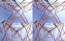
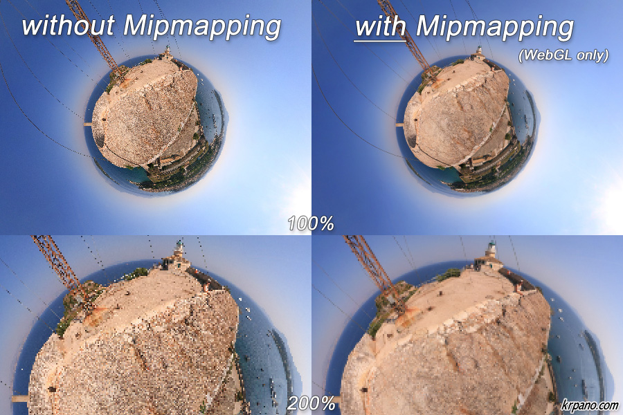
| mipmapping | display.mipmapping | String | "auto" |
|
Define if mipmapping should be used when displaying panos with WebGL. Mipmapping can give a better visual quality and reduce aliasing. Technically mipmapping is only possible for images that have power-of-two sizes.
|
|||
| Attribute name | Full variable name (HTML5 only) | Type | Default value |
| loadwhilemoving | display.loadwhilemoving | String | ... |
Control the tile reloading during movement (panning, zooming).
The loading and adding of new tiles can interrupt smooth movements on slow devices.
|
|||
Examples<display hardwarelimit="512" devices="androidstock" />
<display mipmapping="force" />
Mipmapping Screenshots:

<control>
The mouse and keyboard control settings.
Note - when the krpano viewer shouldn't capture the mouse wheel usage over the viewer (e.g. to allow scrolling the webpage instead of zooming the pano), then have also a look at the mwheel embedding setting.
Examples
Note - when the krpano viewer shouldn't capture the mouse wheel usage over the viewer (e.g. to allow scrolling the webpage instead of zooming the pano), then have also a look at the mwheel embedding setting.
<control usercontrol="all"
         mousetype="moveto"
         touchtype="drag2d"
         zoomtocursor="false"
         zoomoutcursor="true"
         mouseaccelerate="1.0"
         mousespeed="10.0"
         mousefriction="0.8"
         mouseyfriction="1.0"
         mousefovchange="1.0"
         keybaccelerate="0.5"
         keybspeed="10.0"
         keybfriction="0.9"
         keybfovchange="0.75"
         keybinvert="false"
         fovspeed="3.0"
         fovfriction="0.9"
         movetocursor="none"
         cursorsize="10.0"
         headswing="0.0"
         camrollreset="true"
         keycodesleft="37"
         keycodesright="39"
         keycodesup="38"
         keycodesdown="40"
         keycodesin=""
         keycodesout=""
         bouncinglimits="false"
         touchfriction="0.87"
         touchzoom="true"
         />
| Attribute name | Full variable name | Type | Default value |
| usercontrol | control.usercontrol | String | "all" |
|---|---|---|---|
| Allowed user control modes: "all" or "keyb" or "mouse" or "off" | |||
| Attribute name | Full variable name | Type | Default value |
| mousetype | control.mousetype | String | "moveto" |
|
The type of the mouse control: moveto = click and move to set a moving vector drag2d = drag and move the panorama on a 2D axis drag2dsmooth = a 'smoothed' drag2d mode (Flash only) drag3d = drag and move the panorama on a free 3D axis (Flash only) |
|||
| Attribute name | Full variable name | Type | Default value |
| touchtype | control.touchtype | String | "drag2d" |
|
The type of the control on touch devices (iPhone,iPad,Android): drag2d = drag and move the panorama on a 2D axis drag2dsmooth = a 'smoothed' drag2d mode (Flash only) moveto = click and move to set a moving vector Note - in the Android Flashplayer the drag2dsmooth mode was automatically used when using drag2d to improve the visual response. |
|||
| Attribute name | Full variable name | Type | Default value |
| zoomtocursor | control.zoomtocursor | Boolean | false |
| When enabled and zooming in by the mousewheel the pano will zoom toward the position of the mouse cursor. | |||
| Attribute name | Full variable name | Type | Default value |
| zoomoutcursor | control.zoomoutcursor | Boolean | true |
| When zoomtocursor and this setting are enabled and zooming out by the mousewheel the pano will zoom away from the position of the mouse cursor. Otherwise the pano will zoom away from the center of the screen. | |||
| Attribute name | Full variable name | Type | Default value |
| mouseaccelerate | control.mouseaccelerate | Number | 1.0 |
| The acceleration of the mouse controlled moving. | |||
| Attribute name | Full variable name | Type | Default value |
| mousespeed | control.mousespeed | Number | 10.0 |
| The maximum moving speed of the mouse controlled moving. | |||
| Attribute name | Full variable name | Type | Default value |
| mousefriction | control.mousefriction | Number | 0.8 |
| The moving friction of the mouse controlled moves. | |||
| Attribute name | Full variable name | Type | Default value |
| mouseyfriction | control.mouseyfriction | Number | 1.0 |
| An additionally friction for the vertical movement in the moveto control mode. Can be used, with values lower than 1.0, to make the vertical moving less responsive. | |||
| Attribute name | Full variable name | Type | Default value |
| mousefovchange | control.mousefovchange | Number | 1.0 |
| The mouse wheel fov (zoom) change in degrees (=mouse wheel zoom sensibility). | |||
| Attribute name | Full variable name | Type | Default value |
| keybaccelerate | control.keybaccelerate | Number | 0.5 |
|
The acceleration of the keyboard / button controlled moving. |
|||
| Attribute name | Full variable name | Type | Default value |
| keybspeed | control.keybspeed | Number | 10.0 |
| The maximum moving speed of the keyboard / button controlled moving. | |||
| Attribute name | Full variable name | Type | Default value |
| keybfriction | control.keybfriction | Number | 0.9 |
| The moving friction of the keyboard / button controlled moves. | |||
| Attribute name | Full variable name | Type | Default value |
| keybfovchange | control.keybfovchange | Number | 0.75 |
| The keyboard / button fov (zoom) change in degrees (=zoom sensibility). | |||
| Attribute name | Full variable name | Type | Default value |
| keybinvert | control.keybinvert | Boolean | false |
| Invert keyboard / button up and down moves. | |||
| Attribute name | Full variable name | Type | Default value |
| fovspeed | control.fovspeed | Number | 3.0 |
| The maximum fov change / zooming speed. | |||
| Attribute name | Full variable name | Type | Default value |
| fovfriction | control.fovfriction | Number | 0.9 |
| The friction of fov changes / zoomings. | |||
| Attribute name | Full variable name (Flash only) | Type | Default value |
| movetocursor | control.movetocursor | String | "none" |
|
Enable a direction cursor for the "moveto" mousetype. Possible values: none - no special cursor, use the default system arrow cursor vector - a direction vector cursor arrow - a rotating arrow cursor Note - it also possible to define custom mouse cursors with the <cursors> settings. |
|||
| Attribute name | Full variable name (Flash only) | Type | Default value |
| cursorsize | control.cursorsize | Number | 10.0 |
| Size of the movetocursor cursor. | |||
| Attribute name | Full variable name (Flash only) | Type | Default value |
| headswing | control.headswing | Number | 0.0 |
|
Swing / tilt the head / view when fast moving left or right (moveto mode only). This value sets the strength of this effect, from 0 to 10 and higher. |
|||
| Attribute name | Full variable name | Type | Default value |
| camrollreset | control.camrollreset | Boolean | true |
| Should the roll of the camera (view.camroll) be reset back to horizont when moving in the moveto or drag2d mode. | |||
| Attribute name | Full variable name | Type | Default value |
| keycodesleft | control.keycodesleft | String | "37" |
| Keyboard keycodes for moving left, default="37" (cursor left) | |||
| Attribute name | Full variable name | Type | Default value |
| keycodesright | control.keycodesright | String | "39" |
| Keyboard keycodes for moving right, default="39" (cursor right) | |||
| Attribute name | Full variable name | Type | Default value |
| keycodesup | control.keycodesup | String | "38" |
| Keyboard keycodes for moving up, default="38" (cursor up) | |||
| Attribute name | Full variable name | Type | Default value |
| keycodesdown | control.keycodesdown | String | "40" |
| Keyboard keycodes for moving down, default="40" (cursor down) | |||
| Attribute name | Full variable name | Type | Default value |
| keycodesin | control.keycodesin | String | |
|
Keyboard keycodes for zooming-in. Example: to allow zooming-in with the Shift-key, the A-key, and the Plus-key: keycodesin="16,65,107" |
|||
| Attribute name | Full variable name | Type | Default value |
| keycodesout | control.keycodesout | String | |
|
Keyboard keycodes for zooming-out. Example: to allow zooming-out with the CTRL-key, the Y/Z-keys, and the Minus-key: keycodesout="17,89,90,109" |
|||
| Attribute name | Full variable name (HTML5 only) | Type | Default value |
| bouncinglimits | control.bouncinglimits | Boolean | false |
| Bounce back when hitting the panning or zooming limits (drag control only). | |||
| Attribute name | Full variable name | Type | Default value |
| touchfriction | control.touchfriction | Number | 0.87 |
| The moving friction for touch controls (iPhone/iPad/Android). | |||
| Attribute name | Full variable name (HTML5 only) | Type | Default value |
| touchzoom | control.touchzoom | Boolean | true |
| Enable or disable the 2-finger zoom gesture. | |||
Examples
Use dragging control:
Zoom toward the mouse cursor:
Allow zooming by keys:
<control mousetype="drag2D" />
Zoom toward the mouse cursor:
<control zoomtocursor="true" />
Allow zooming by keys:
<control keycodesin="16,65,107" keycodesout="17,89,90,109" />
<cursors> (Flash only)
Customize the mouse cursor with own images:
It's possible to use one single image that contains all different mouse states image, this reduces the necessary download requests and speed up loading. The individual images will be selected by defining the crop pixel coordinates for them.
Examples
It's possible to use one single image that contains all different mouse states image, this reduces the necessary download requests and speed up loading. The individual images will be selected by defining the crop pixel coordinates for them.
<cursors url=""
         type="8way"
         move=""
         drag=""
         arrow_l=""
         arrow_r=""
         arrow_u=""
         arrow_d=""
         arrow_lu=""
         arrow_ru=""
         arrow_ld=""
         arrow_rd=""
         />
| Attribute name | Full variable name | Type | Default value |
| url | cursors.url | String | |
|---|---|---|---|
| Path/url to the cursors images. This image must contain all images for all cursor states. The image for the certain cursor is selected by defining the position and size of a (crop) rectangle. | |||
| Attribute name | Full variable name | Type | Default value |
| type | cursors.type | String | "8way" |
|
drag = move/drag 4way = move/drag/arrow_l/arrow_u,arrow_r,arrow_d 8way = all |
|||
| Attribute name | Full variable name | Type | Default value |
| move drag arrow_l arrow_r arrow_u arrow_d arrow_lu arrow_ru arrow_ld arrow_rd |
cursors.move cursors.drag cursors.arrow_l cursors.arrow_r cursors.arrow_u cursors.arrow_d cursors.arrow_lu cursors.arrow_ru cursors.arrow_ld cursors.arrow_rd |
String String String String String String String String String String |
|
|
move = during normal moving (without mouse button down) drag = mouse button down arrow_* = mouse button down and moving in direction |
|||
Examples<control mousetype="drag2D" />
<cursors url="drag-cursors.png"
type="drag"
move="2|0|30|32"
drag="37|0|30|32"
/>
<control mousetype="moveto" />
<cursors url="arrow-cursors.png"
         type="4way"
         move="112|0|28|28"
         drag="112|0|28|28"
         arrow_r="0|0|28|28"
         arrow_d="28|0|28|28"
         arrow_l="56|0|28|28"
         arrow_u="84|0|28|28"
         />
<autorotate>
Automatic rotation / moving / zooming when there is no user-interaction in the pano.
Examples
<autorotate enabled="false"
            waittime="1.5"
            accel="1.0"
            speed="10.0"
            horizon="0.0"
            tofov="off"
            />
| Attribute name | Full variable name | Type | Default value |
| enabled | autorotate.enabled | Boolean | false |
|---|---|---|---|
| Enable/disable the automatic rotation. | |||
| Attribute name | Full variable name | Type | Default value |
| waittime | autorotate.waittime | Number | 1.5 |
| The time in seconds to wait after the last user-interaction before starting the automatic rotation. | |||
| Attribute name | Full variable name | Type | Default value |
| accel | autorotate.accel | Number | 1.0 |
| The rotation acceleration in degrees/second. | |||
| Attribute name | Full variable name | Type | Default value |
| speed | autorotate.speed | Number | 10.0 |
|
The maximum rotation speed in degrees/second. Use a negative value for a rotation to left. |
|||
| Attribute name | Full variable name | Type | Default value |
| horizon | autorotate.horizon | Number | 0.0 |
|
Move / rotate to the given horizon (0.0 = middle of the pano). Set the value to "off" or any other non-number value to disable it. |
|||
| Attribute name | Full variable name | Type | Default value |
| tofov | autorotate.tofov | Number | NaN |
|
Zoom to the given field of view (fov). Set it to "off" or any other non-number value to disable it. |
|||
Examples<autorotate enabled="true" />
<autorotate enabled="true"
            waittime="5.0"
            speed="-3.0"
            horizon="0.0"
            tofov="120.0"
            />
<layer> /
<plugin>
The <layer> or <plugin> elements can be used to include images, logos, buttons or dynamic plugins (e.g. krpano plugins).
To combine, stack, sublayer several <layer> or <plugin> elements, either
the parent setting can be used, or the children <layer> / <plugin> elements
can be declared as child xml elements. In this case the parent and keep will
be automatically assigned to the parent element.
Note - the <layer> or <plugin> elements are internally exactly the same elements, only with different names!
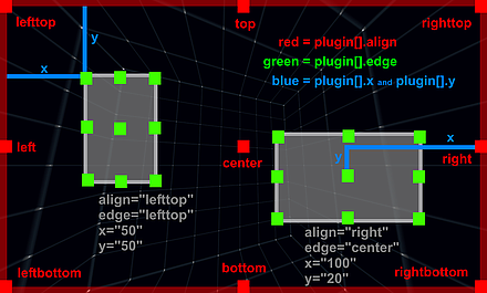
Illustration of the relations of "align", "edge", "x", "y", "width", "height":
 Examples
Note - the <layer> or <plugin> elements are internally exactly the same elements, only with different names!
<plugin name="..."
        type="image"
        url="..."
        alturl=""
        keep="false"
        devices="all"
        parent=""
        visible="true"
        enabled="true"
        handcursor="true"
        maskchildren="false"
        scalechildren="false"
        zorder=""
        capture="true"
        children="true"
        preload="false"
        blendmode="normal"
        style=""
        align=""
        edge=""
        x=""
        y=""
        ox=""
        oy=""
        rotate="0.0"
        width=""
        height=""
        scale="1.0"
        pixelhittest="false"
        smoothing="true"
        accuracy="0"
        alpha="1.0"
        autoalpha="false"
        usecontentsize="false"
        scale9grid=""
        crop=""
        onovercrop=""
        ondowncrop=""
        mask=""
        effect=""
        bgcolor="0x000000"
        bgalpha="0.0"
        bgborder="0"
        bgroundedge="0"
        bgshadow=""
        bgcapture="false"
        onover=""
        onhover=""
        onout=""
        onclick=""
        ondown=""
        onup=""
        onloaded=""
        />
<layer name="..."
       type="image"
       url="..."
       alturl=""
       keep="false"
       devices="all"
       parent=""
       visible="true"
       enabled="true"
       handcursor="true"
       maskchildren="false"
       scalechildren="false"
       zorder=""
       capture="true"
       children="true"
       preload="false"
       blendmode="normal"
       style=""
       align=""
       edge=""
       x=""
       y=""
       ox=""
       oy=""
       rotate="0.0"
       width=""
       height=""
       scale="1.0"
       pixelhittest="false"
       smoothing="true"
       accuracy="0"
       alpha="1.0"
       autoalpha="false"
       usecontentsize="false"
       scale9grid=""
       crop=""
       onovercrop=""
       ondowncrop=""
       mask=""
       effect=""
       bgcolor="0x000000"
       bgalpha="0.0"
       bgborder="0"
       bgroundedge="0"
       bgshadow=""
       bgcapture="false"
       onover=""
       onhover=""
       onout=""
       onclick=""
       ondown=""
       onup=""
       onloaded=""
       />
| Full variable name (read only) | Type | Default value | |
| plugin.countlayer.count | int | 0 | |
|---|---|---|---|
| The count of all layer / plugin elements. | |||
| Full variable name | Type | Default value | |
| plugin.enabledlayer.enabled | Boolean | true | |
| Enable/disable the whole layer / plugin layer for receiving mouse events. | |||
| Full variable name | Type | Default value | |
| plugin.visiblelayer.visible | Boolean | true | |
| Show/hide the whole layer / plugin layer. | |||
| Full variable name | Type | Default value | |
| plugin.alphalayer.alpha | Number | 1.0 | |
| Controls the transparency / alpha of the whole layer / plugin layer. | |||
| Full variable name (as3 usage only) | Type | Default value | |
| plugin.layerlayer.layer | Sprite | ||
|
Actionscript 3 Sprite object of the layer / plugin layer. | |||
| Attribute name | Full variable name | Type | Default value |
| name | plugin[name].name | String | |
| name | layer[name].name | String | |
| The name of the current layer / plugin element (see the name notes). | |||
| Attribute name | Full variable name (read only) | Type | Default value |
| indexindex | plugin[name].indexlayer[name].index | int | |
| The index of the current layer / plugin element. | |||
| Attribute name | Full variable name | Type | Default value |
| type | plugin[name].type | String | "image" |
| type | layer[name].type | String | "image" |
|
Type of the layer / plugin element. Possible settings:
| |||
| Attribute name | Full variable name | Type | Default value |
| url | plugin[name].url | String | |
| url | layer[name].url | String | |
|
The path/url to the layer / plugin image file. (see also the url notes) Supported file types: SWF, JPG, PNG, GIF. | |||
| Attribute name | Full variable name | Type | Default value |
| alturl | plugin[name].alturl | String | |
| alturl | layer[name].alturl | String | |
|
An 'alternative' path/url for the layer / plugin image file for the krpano HTML5 viewer.
When setting the alturl setting, the normal url setting will be overwritten in the HTML5 viewer - that means, declare the alturl always after the url setting.
This can be used to use an alternative image, e.g. an animated gif instead of an animated flash. Supported file types: JPG, PNG, GIF and Animated GIF. Note - the alturl setting should be used only in the static-xml-code! Inside dynamic/actions code, if() actions like: if(device.html5, set(url,html5.png), set(url,flash.png) );should be used to set different urls. | |||
| Attribute name | Full variable name | Type | Default value |
| keep | plugin[name].keep | Boolean | false |
| keep | layer[name].keep | Boolean | false |
|
Should this layer / plugin element be kept or removed when loading a new pano. See also the loadpano() action. | |||
| Attribute name | Full variable name | Type | Default value |
| visible | plugin[name].visible | Boolean | true |
| visible | layer[name].visible | Boolean | true |
| Visibility of the layer / plugin element. | |||
| Attribute name | Full variable name | Type | Default value |
| enabled | plugin[name].enabled | Boolean | true |
| enabled | layer[name].enabled | Boolean | true |
|
Enables the layer / plugin element to receive mouse events.
When set to "false" then the mouse events will be routed to the underlying elements. | |||
| Attribute name | Full variable name | Type | Default value |
| handcursor | plugin[name].handcursor | Boolean | true |
| handcursor | layer[name].handcursor | Boolean | true |
| Show a hand cursor when mouse is over the layer / plugin element. | |||
| Attribute name | Full variable name | Type | Default value |
| maskchildren | plugin[name].maskchildren | Boolean | false |
| maskchildren | layer[name].maskchildren | Boolean | false |
|
When set to true then all children elements that are outside of the parent element will be clipped / masked out. HTML5 Safari / iOS notes - the when using maskchildren=true on a container element that has rounded edges and shadows (by using the bgroundedge and bgshadow settings) then the children elements will be not clipped on the rounded edges. This is a bug of the Safari browser (Desktop and iOS), all other browsers are fine. | |||
| Attribute name | Full variable name | Type | Default value |
| zorder | plugin[name].zorder | String | |
| zorder | layer[name].zorder | String | |
|
Deep / 'Z' ordering of the layer / plugin elements. This value can be any string or number. All layer / plugin elements with a zorder setting will be sorted by the given value. When nothing is set - then the order is undefined and depends on the loading/finishing order of the browser. Note - this is an important setting for overlapping elements! HTML5 Notes - the zorder should be a value between 0 and 100, no negative values! | |||
| Attribute name | Full variable name | Type | Default value |
| capturecapture | layer[name].captureplugin[name].capture | Boolean | true |
|
This is an additional setting to the enabled setting: When enabled=true and capture=true then the mouse events will be only sent to this layer / plugin, no movement / controlling of the pano is possible. When enabled=true and capture=false then the mouse events will be sent to the layer / plugin and also to all underlying elements, controlling the pano will be still possible. | |||
| Attribute name | Full variable name | Type | Default value |
| childrenchildren | layer[name].childrenplugin[name].children | Boolean | true |
| Enables the children elements of the current layer / plugin element for receiving mouse events. | |||
| Attribute name | Full variable name | Type | Default value |
| preloadpreload | layer[name].preloadplugin[name].preload | Boolean | false |
|
Preload the layer / plugin url before loading the pano and before executing any actions. This
can be used to force some element to be there and ready before everything else starts. Note - the onloaded event doesn't work / can't be used when preloading is enabled! | |||
| Attribute name | Full variable name (Flash only) | Type | Default value |
| blendmodeblendmode | layer[name].blendmodeplugin[name].blendmode | String | "normal" |
|
Blending / mixing mode - possible settings: normal, layer, screen, add, subtract, difference, multiply, overlay, lighten, darken, hardlight, invert. See here for more details about all available blending modes: http://help.adobe.com/.../BlendMode.html And here for some illustrations / examples: http://help.adobe.com/.../DisplayObject.html#blendMode | |||
| Attribute name | Full variable name | Type | Default value |
| style | plugin[name].style | String | |
| style | layer[name].style | String | |
|
Load the attributes from one or more <style> elements. This can be used to reduce the xml code - the attributes that are the same for more layer / plugin or hotspot elements can be stored together at one place in a <style> element. To specify more than one style, separate the style names by pipe | characters. Note - the attributes that were defined in a style can NOT be overwritten in the layer / plugin / hotspots definition! Example: <style name="style1" alpha="0.5" scale="0.5" ... /> A style can be also loaded dynamically by the loadstyle(name) action. | |||
| Attribute name | Full variable name | Type | Default value |
| align | plugin[name].align | String | |
| align | layer[name].align | String | |
|
Alignment / origin-point position of the layer / plugin element on the screen. Possible values: lefttop, left, leftbottom, top, center, bottom, righttop, right, rightbottom - or - no value (empty or null) When NOT set (the default) no positioning will be done by krpano (useful / necessary for some flash/swf plugins). | |||
| Attribute name | Full variable name | Type | Default value |
| edge | plugin[name].edge | String | |
| edge | layer[name].edge | String | |
|
Edge / anchor-point of the layer / plugin element. Possible values: lefttop, left, leftbottom, top, center, bottom, righttop, right, rightbottom - or - no value (empty or null) When NOT set (the default) the same setting as in the align attribute will be used. | |||
| Attribute name | Full variable name | Type | Default value |
| x y | plugin[name].x plugin[name].y | String String | |
| x y | layer[name].x layer[name].y | String String | |
|
Distance from the align point to the edge point. This can be a absolute pixel value or a relative (to the screenwidth or screenheight) percent value. Note - for right/bottom aligned elements this distance will be measured from the right/bottom side. | |||
| Attribute name | Full variable name | Type | Default value |
| ox oyox oy | layer[name].ox layer[name].oyplugin[name].ox plugin[name].oy | String String | |
|
Offset / parallel-shift of the layer / plugin element. This values will be added to the x/y values. This can be a absolute pixel value or a relative (to layer / plugin size) percent value. | |||
| Attribute name | Full variable name | Type | Default value |
| rotate | plugin[name].rotate | Number | 0.0 |
| rotate | layer[name].rotate | Number | 0.0 |
| Rotation of the layer / plugin element in degrees. | |||
| Attribute name | Full variable name | Type | Default value |
| width height | plugin[name].width plugin[name].height | String String | |
| width height | layer[name].width layer[name].height | String String | |
|
Destination size of the layer / plugin element - the image will be scaled to that size. This can be a absolute pixel value or a relative (to the screenwidth or screenheight) percent value. When not set - the size of the loaded image will be used. Negative values - when using negative values as size, then the resulting size will be the size of the parent element (or the size of the stage when there is no parent) minus the given negative value. Additionally it's possible to use the special value "prop" to scale an image via width or height by keeping it proportions (e.g. set width or height to a value and the other setting to "prop" - width="500" height="prop"). | |||
| Attribute name | Full variable name | Type | Default value |
|
minwidth maxwidth minheight maxheight minwidth maxwidth minheight maxheight |
layer[name].minwidth layer[name].maxwidth layer[name].minheight layer[name].maxheight plugin[name].minwidth plugin[name].maxwidth plugin[name].minheight plugin[name].maxheight |
int int int int |
0 0 0 0 |
|
Limit the resulting layer size. Only absolute pixel values are possible for these settings. When the value for a min/max setting is 0, it will be disabled/ignored. Dynamic changes of these settings will not trigger an instant update of the layer element. | |||
| Attribute name | Full variable name (read only) | Type | Default value |
| imagewidth imageheightimagewidth imageheight | layer[name].imagewidth layer[name].imageheightplugin[name].imagewidth plugin[name].imageheight | int int | |
| These variables contain the original unscaled pixel size of the loaded image, this information are first available after the onloaded event. | |||
| Attribute name | Full variable name (read only) | Type | Default value |
| pixelwidth pixelheightpixelwidth pixelheight | layer[name].pixelwidth layer[name].pixelheightplugin[name].pixelwidth plugin[name].pixelheight | int int | |
| These variables contain the final pixel size of the element, but note - they don't get updated immediately when changing the normal width/height/scale variables, the update happens after a screen refresh or when calling the updatepos() action. | |||
| Attribute name | Full variable name (read only) | Type | Default value |
| pixelx pixelypixelx pixely | layer[name].pixelx layer[name].pixelyplugin[name].pixelx plugin[name].pixely | int int | |
|
These variables contain the final pixel position of the element, but note - they don't get updated immediately when changing the
align/edge/x/y/ox/oy variables, the update happens after a screen refresh or when calling the updatepos() action. Note - the values can differ between Flash and HTML5 when layering or scaling is involved due different technical implementations. | |||
| Attribute name | Full variable name | Type | Default value |
| scale | plugin[name].scale | Number | 1.0 |
| scale | layer[name].scale | Number | 1.0 |
| Scaling of the layer / plugin element. | |||
| Attribute name | Full variable name (Flash only) | Type | Default value |
| pixelhittestpixelhittest | layer[name].pixelhittestplugin[name].pixelhittest | Boolean | false |
|
Enabling a pixel accurate hit testing which respects the transparency of the image instead of using the bounding box (Flash only). Note - use this setting with care! The pixel accurate hit-test is a much heavier operation than the normal default bounding box check! | |||
| Attribute name | Full variable name (Flash only) | Type | Default value |
| smoothingsmoothing | layer[name].smoothingplugin[name].smoothing | Boolean | true |
| Pixel smoothing when scaling. | |||
| Attribute name | Full variable name | Type | Default value |
| accuracyaccuracy | layer[name].accuracyplugin[name].accuracy | int | 0 |
|
Accuracy of the layer / plugin image positioning: When set to 0 (the default) the pixel positions will be rounded to full pixel values. When set to 1 no rounding of the position values will be done, but then the image can become blurry due this. Note - if accuracy=1 would work depends also on the Flashplayer display quality settings and if the browser is supporting sub-pixel-precise CSS coordinates. | |||
| Attribute name | Full variable name | Type | Default value |
| alpha | plugin[name].alpha | Number | 1.0 |
| alpha | layer[name].alpha | Number | 1.0 |
|
Alpha value / transparency of the layer / plugin element. 0.0 = fully transparent, 1.0 = fully visible Note - even when set to 0.0 - the element will be still there and click-able - to hide it completely the visible attribute must be set to false! | |||
| Attribute name | Full variable name | Type | Default value |
| autoalphaautoalpha | layer[name].autoalphaplugin[name].autoalpha | Boolean | false |
| When set to "true", then visible will be automatically set to "false" when alpha is 0.0 and back to "true" when alpha is bigger then 0.0. | |||
| Attribute name | Full variable name (Flash only) | Type | Default value |
| usecontentsizeusecontentsize | layer[name].usecontentsizeplugin[name].usecontentsize | Boolean | false |
| When a .swf file will be loaded, then are two possibilities to determinate its size / dimension - either the size of full canvas of the flash object will be used (usecontentsize=false, the default) - or - only the size of the drawn content there (usecontentsize=true). | |||
| Attribute name | Full variable name | Type | Default value |
| scale9gridscale9grid | layer[name].scale9gridplugin[name].scale9grid | String | |
|
Defines a grid in pixel coordinates that splits the layer / plugin image into 9 segments.
And when scaling the layer / plugin via the width / height / scale values, the 'edge' segments
will be kept unscaled and only the 'middle' segments will be scaled. When using scale9grid, then scalechildren always will be false. Syntax: scale9grid="x-position|y-position|width|height|prescale*"
| |||
| Attribute name | Full variable name | Type | Default value |
| crop onovercrop ondowncrop | plugin[name].crop plugin[name].onovercrop plugin[name].ondowncrop | String String String | |
| crop onovercrop ondowncrop | layer[name].crop layer[name].onovercrop layer[name].ondowncrop | String String String | |
|
Crop / cut out a rectangular area of the source image. Usefull to use only one single image
for serval image elements. onovercrop / ondowncrop - different crop areas for mouse over and mouse button down states. Syntax: crop="x-position|y-position|width|height" | |||
| Attribute name | Full variable name | Type | Default value |
| parent | plugin[name].parent | String | |
| parent | layer[name].parent | String | |
|
Assign the current layer / plugin to be a child element of an other layer / plugin or hotspot element.
The assigned layer / plugin will be aligned inside the parent element. There are two special predefined parent elements:
Syntax: Either use only the name of the parent layer / plugin: parent="name"Or the full path/name of the layer / plugin or hotspot that should be the parent element: parent="layer[name]" parent="hotspot[name]"Or to align the layer / plugin element on the outside or behind the pano area: parent="STAGE" parent="BGLAYER" Note - distorted hotspots can't be used as parent at the moment! | |||
| Attribute name | Full variable name | Type | Default value |
| scalechildren | plugin[name].scalechildren | Boolean | false |
| scalechildren | layer[name].scalechildren | Boolean | false |
| Should a child layer / plugin element, that have been assigned by parent also be scaled when the current layer / plugin element will scaled. | |||
| Attribute name | Full variable name (Flash only) | Type | Default value |
| maskmask | layer[name].maskplugin[name].mask | String | |
|
Use an other layer / plugin or hotspot image as mask. The image should have an alpha channel (e.g. use a .png image for it).
Without alpha channel the bounding box area of the layer / plugin will be used as mask. Syntax: Either use only the name of a other layer / plugin: mask="name"Or the full path/name of the layer / plugin or hotspot that should be used as mask: mask="layer[name]" mask="hotspot[name]" Note - for rendering performance reasons the mask shouldn't not be used with distorted hotspots! HTML5 Notes - for masking children elements that works the same in Flash and HTML5 use the newer maskchildren setting. | |||
| Attribute name | Full variable name (Flash only) | Type | Default value |
| effecteffect | layer[name].effectplugin[name].effect | String | |
|
Apply bitmap effects to the layer / plugin image. That can be any combinations of these effect functions: glow(color,alpha,range,strength); dropshadow(depth,angle,color,range,strength); blur(radius); | |||
| Attribute name | Full variable name | Type | Default value |
| bgcolor | plugin[name].bgcolor | int | 0x000000 |
| bgcolor | layer[name].bgcolor | int | 0x000000 |
| Background color of the container element (only available when type=container). | |||
| Attribute name | Full variable name | Type | Default value |
| bgalpha | plugin[name].bgalpha | Number | 0.0 |
| bgalpha | layer[name].bgalpha | Number | 0.0 |
| Transparency / alpha of the background color of the container element (only available when type=container). | |||
| Attribute name | Full variable name | Type | Default value |
| bgborder | plugin[name].bgborder | String | "0" |
| bgborder | layer[name].bgborder | String | "0" |
|
Add borders around the type=container layer element. Syntax: bgborder="widths color alpha" Parameters:
| |||
| Attribute name | Full variable name | Type | Default value |
| bgroundedge | plugin[name].bgroundedge | String | "0" |
| bgroundedge | layer[name].bgroundedge | String | "0" |
|
Define rounded edges of the container background color shape. A value sets the edge rounding radius in pixels. Four values can be set, one for each edge (separated by space characters). They are given in the order: top-left, top-right, bottom-right, bottom-left. If bottom-left is omitted, it is the same as top-right. If bottom-right is omitted, it is the same as top-left. If top-right is omitted, it is the same as top-left. | |||
| Attribute name | Full variable name | Type | Default value |
| bgshadow | plugin[name].bgshadow | String | |
| bgshadow | layer[name].bgshadow | String | |
|
Add a shadow behind the type=container layer element. Basic Syntax (5 parameters, supported by Flash and HTML5): bgshadow="xoffset yoffset blur color alpha" Advanced Syntax (6 or more parameters, supported only by HTML5): bgshadow="xoffset yoffset blur spread color alpha inset, ..." Parameters:
| |||
| Attribute name | Full variable name | Type | Default value |
| bgcapture | plugin[name].bgcapture | Boolean | false |
| bgcapture | layer[name].bgcapture | Boolean | false |
| Capture mouse events on the background of the container element (only available when type=container and bgalpha > 0.0). | |||
| Attribute name | Full variable name (read only) | Type | Default value |
| loadingloading | layer[name].loadingplugin[name].loading | Boolean | false |
|
A boolean read-only variable that indicates that the layer / plugin is currently loading an image. | |||
| Attribute name | Full variable name (read only) | Type | Default value |
| loadedloaded | layer[name].loadedplugin[name].loaded | Boolean | false |
| A boolean read-only variable that indicates that the layer / plugin has loaded the given image. | |||
| Attribute name | Full variable name (read only) | Type | Default value |
| loadedurlloadedurl | layer[name].loadedurlplugin[name].loadedurl | String | |
| The loadedurl attribute contains the full url of the currently loaded image. | |||
| Attribute name | Full variable name (read only) | Type | Default value |
| hoveringhovering | layer[name].hoveringplugin[name].hovering | Boolean | false |
| A boolean read-only variable that indicates that the mouse cursor it currently over the layer / plugin. | |||
| Attribute name | Full variable name (read only) | Type | Default value |
| pressedpressed | layer[name].pressedplugin[name].pressed | Boolean | false |
| A boolean read-only variable that indicates that the mouse button was pressed on the layer / plugin and is still hold down. | |||
| Attribute name | Full variable name | Type | Default value |
| onover | plugin[name].onover | Action Event | |
| onover | layer[name].onover | Action Event | |
| Actions / functions that will be called when the mouse moves over the layer / plugin element. | |||
| Attribute name | Full variable name | Type | Default value |
| onhover | plugin[name].onhover | Action Event | |
| onhover | layer[name].onhover | Action Event | |
| Actions / functions that will be called in intervals (15 times per second) when the mouse stays over / hovers the layer / plugin element. | |||
| Attribute name | Full variable name | Type | Default value |
| onout | plugin[name].onout | Action Event | |
| onout | layer[name].onout | Action Event | |
| Actions / functions that will be called when the mouse moves out of the layer / plugin element. | |||
| Attribute name | Full variable name | Type | Default value |
| onclick | plugin[name].onclick | Action Event | |
| onclick | layer[name].onclick | Action Event | |
| Actions / functions that will be called when there is a mouse click on the layer / plugin element. | |||
| Attribute name | Full variable name | Type | Default value |
| ondown | plugin[name].ondown | Action Event | |
| ondown | layer[name].ondown | Action Event | |
| Actions / functions that will be called when the mouse button will be pressed down on the layer / plugin element. | |||
| Attribute name | Full variable name | Type | Default value |
| onup | plugin[name].onup | Action Event | |
| onup | layer[name].onup | Action Event | |
| Actions / functions that will be called when the previously pressed mouse button will be released. | |||
| Attribute name | Full variable name | Type | Default value |
| onloaded | plugin[name].onloaded | Action Event | |
| onloaded | layer[name].onloaded | Action Event | |
| Actions / functions that will be called when the loading of the layer / plugin image is done. | |||
| Attribute name | Full variable name | Type | Default value |
| loaderloader | layer[name].loaderplugin[name].loader | ||
|
Flash: Actionscript 3 Loader object of the loaded layer / plugin image. HTML5: HTML Image element. | |||
| Attribute name | Full variable name | Type | Default value |
| spritesprite | layer[name].spriteplugin[name].sprite | ||
|
Flash: Actionscript 3 Sprite object of the layer / plugin element. HTML5: HTML DOM element (div) of the layer / plugin element. | |||
| Function name | Type | ||
| layer[name].loadstyle(name)plugin[name].loadstyle(name) | Action | ||
| An action of the layer / plugin element to load interactively settings from a <style> tag. | |||
| Function name | Type | ||
| layer[name].registercontentsize(width,height)plugin[name].registercontentsize(width,height) | Action | ||
|
The registercontentsize action can be used to set / register the 'original / source / unscaled' size of the layer / plugin element.
By default the imagesize or the size of the swf file will be used - this source size can be changed here. For HTML5 / Javascript Plugins that want to draw custom stuff this function call is necessary to set the source size because Javascript Plugins don't have any information about its size. | |||
| Function name | Type | ||
| layer[name].resetsize()plugin[name].resetsize() | Action | ||
| An action to set the width and height values back to the source size of the loaded image. This can be used after changing the url value to get the size of the new loaded image. | |||
| Function name | Type | ||
| layer[name].updatepos()plugin[name].updatepos() | Action | ||
| Updates / recalculates the position and size of the layer / plugin immediately (normally this will be done automatically with the next screen refresh). After calling this actions the pixelwidth and pixelheight variables will contain the final pixel sizes of the layer / plugin element. | |||
| Function name | Type | ||
| layer[name].changeorigin(align,edge)plugin[name].changeorigin(align,edge) | Action | ||
| An action to change the alignment and edge of a layer / plugin element without changing its current position. The x/y values will be recalculated to keep the current position. | |||
| Function name (plugininterface only) | Type | return | |
| layer[name].getfullpath()plugin[name].getfullpath() | Action | String | |
| A function that returns the full path/name of the layer / plugin element. Because of the return value this action is only callable from the plugin interface. | |||
Illustration of the relations of "align", "edge", "x", "y", "width", "height":
Examples
<layer name="logo"
       url="logoimage.png"
       align="rightbottom" x="20" y="20"
       onclick="openurl('http://...');"
       >
<layer name="imagebar" type="container" width="100%" height="200" align="leftbottom" bgcolor="0x000000" bgalpha="0.5">
  <layer name="item1" url="image1.jpg" align="left" x="10" />
  <layer name="item2" url="image2.jpg" align="left" x="110" />
  <layer name="item3" url="image3.jpg" align="left" x="210" />
</layer>
<hotspot>
Hotspots are areas in the panorama, which react on mouse hovering or clicking.
They can be used to load other panoramas, links to other urls, change the viewing ...
There are currently 2 types of Hotspots:
- if the "url" attribute is set it is a image hotspot
- if not and there are points defined it is a polygonal hotspot
There are currently 2 types of Hotspots:
- Polygonal Hotspots
these are areas which are defined by a set of points
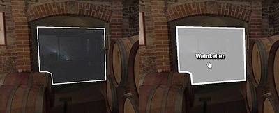
- Image Hotspots
these are images or flash movies as hotspots

- if the "url" attribute is set it is a image hotspot
- if not and there are points defined it is a polygonal hotspot
<hotspot name="..."
         type="image"
         url="..."
         alturl="..."
         keep="false"
         devices="all"
         visible="true"
         enabled="true"
         handcursor="true"
         maskchildren="false"
         zorder=""
         zorder2="0.0"
         capture="true"
         children="true"
         blendmode="normal"
         style=""
         ath="0.0" atv="0.0"
         edge="center"
         ox="0"
         oy="0"
         zoom="false"
         distorted="false" rx="0.0" ry="0.0" rz="0.0"
         details="8"
         inverserotation="false"
         flying="0.0"
         width="" height=""
         scale="1.0"
         rotate="0.0"
         pixelhittest="false"
         smoothing="true"
         accuracy="1"
         alpha="1.0"
         autoalpha="false"
         usecontentsize="false"
         scale9grid=""
         crop=""
         onovercrop=""
         ondowncrop=""
         scalechildren="false"
         mask=""
         effect=""
         onover=""
         onhover=""
         onout=""
         ondown=""
         onup=""
         onclick=""
         onloaded=""
         />
<hotspot name="..."
         keep="false"
         visible="true"
         enabled="true"
         handcursor="true"
         capture="true"
         blendmode="normal"
         style=""
         alpha="1.0"
         autoalpha="false"
         fillcolor="0xAAAAAA"
         fillalpha="0.5"
         borderwidth="3.0"
         bordercolor="0xAAAAAA"
         borderalpha="1.0"
         onover=""
         onhover=""
         onout=""
         ondown=""
         onup=""
         onclick=""
         onloaded=""
>
    <point ath="..." atv="..." />
    <point ath="..." atv="..." />
    <point ath="..." atv="..." />
    ...
</hotspot>
| Full variable name (read only) | Type | Default value | |
| hotspot.count | int | 0 | |
|---|---|---|---|
| The count / number of all hotspot elements. | |||
| Full variable name | Type | Default value | |
| hotspot.enabled | Boolean | true | |
| Enable/disable the whole hotspots layer for receiving mouse events. | |||
| Full variable name | Type | Default value | |
| hotspot.visible | Boolean | true | |
| Show/hide the whole hotspots layer. | |||
| Full variable name | Type | Default value | |
| hotspot.alpha | Number | 1.0 | |
| Controls the transparency / alpha of the whole hotspots layer. | |||
| Full variable name (as3 usage only) | Type | Default value | |
| hotspot.layer | Sprite | ||
|
Actionscript 3 Sprite object of the hotspots layer. |
|||
| Attribute name | Full variable name | Type | Default value |
| name | hotspot[name].name | String | |
| The name of the current hotspot element (see the name notes). | |||
| Attribute name | Full variable name (read only) | Type | Default value |
| index | hotspot[name].index | int | |
| The index of the current hotspot element. | |||
| Attribute name | Full variable name | Type | Default value |
| type | hotspot[name].type | String | "image" |
|
Type of the hotspot element. Possible settings:
|
|||
| Attribute name | Full variable name | Type | Default value |
| url | hotspot[name].url | String | |
|
The path/url to the hotspot image file. (see also the url notes) Supported file types: SWF, JPG, PNG, GIF. Note - when "url" will be set, the hotspot will be an image hotspot! |
|||
| Attribute name | Full variable name | Type | Default value |
| alturl | hotspot[name].alturl | String | |
|
An 'alternative' path/url for the hotspot image file for the krpano HTML5 viewer.
When setting the alturl setting, the normal url setting will be overwritten in the HTML5 viewer - that means, declare the alturl always after the url setting.
This can be used to use an alternative image, e.g. an animated gif instead of an animated flash. Supported file types: JPG, PNG, GIF and Animated GIF. Note - the alturl setting should be used only in the static-xml-code! Inside dynamic/actions code, if() actions like: if(device.html5, set(url,html5.png), set(url,flash.png) );should be used to set different urls. |
|||
| Attribute name | Full variable name | Type | Default value |
| keep | hotspot[name].keep | Boolean | false |
|
Should this hotspot element be kept or removed when loading a new pano. See also the loadpano() action. |
|||
| Attribute name | Full variable name | Type | Default value |
| visible | hotspot[name].visible | Boolean | true |
| Visibility of the hotspot element. | |||
| Attribute name | Full variable name | Type | Default value |
| enabled | hotspot[name].enabled | Boolean | true |
|
Enables the hotspot element to receive mouse events.
When set to "false" then the mouse events will be routed to the underlying elements. |
|||
| Attribute name | Full variable name | Type | Default value |
| handcursor | hotspot[name].handcursor | Boolean | true |
| Show a hand cursor when mouse is over the hotspot element. | |||
| Attribute name | Full variable name | Type | Default value |
| maskchildren | hotspot[name].maskchildren | Boolean | false |
| When set to true then all child elements that are outside of the parent element will be clipped / masked out. | |||
| Attribute name | Full variable name | Type | Default value |
| zorder | hotspot[name].zorder | String | |
|
Deep / "Z" ordering of the hotspot elements. This value can be any string or number. All hotspot elements with a zorder setting will be sorted by the given value. When nothing is set - then the order is undefined and depends on the loading/finishing order of the browser. Note - this is an important setting for overlapping elements! HTML5 Note - the zorder should be a value between 0 and 100, no negative values! |
|||
| Attribute name | Full variable name (HTML5 only) | Type | Default value |
| zorder2 | hotspot[name].zorder2 | Number | 0.0 |
|
The zorder2 setting is for ordering normal and distorted hotspots in the HTML5 viewer.
Due browser/css related limitations it is not always possible to mix / order normal hotspots and distorted hotspots
withhin the same layer. But by using the new zorder2 setting, it is possible to define if a normal, non-distorted
hotspot should be above or below the other distorted hotspots. Usage:
|
|||
| Attribute name | Full variable name | Type | Default value |
| capture | hotspot[name].capture | Boolean | true |
|
This is an additional setting to the enabled setting: When enabled=true and capture=true then the mouse events will be only sent to this hotspot, no movement / controlling of the pano is possible. When enabled=true and capture=false then the mouse events will be sent to the hotspot and also to all underlying elements, controlling the pano will be still possible. |
|||
| Attribute name | Full variable name | Type | Default value |
| children | hotspot[name].children | Boolean | true |
| Enables the children elements of the current hotspot element for receiving mouse events. | |||
| Attribute name | Full variable name (Flash only) | Type | Default value |
| blendmode | hotspot[name].blendmode | String | "normal" |
|
Blending / mixing mode - possible settings: normal, layer, screen, add, subtract, difference, multiply, overlay, lighten, darken, hardlight, invert. See here for more details about all available blending modes: http://help.adobe.com/.../BlendMode.html And here for some illustrations / examples: http://help.adobe.com/.../DisplayObject.html#blendMode |
|||
| Attribute name | Full variable name | Type | Default value |
| style | hotspot[name].style | String | |
|
Load the attributes from one or more <style> elements. This can be used to reduce the xml code - the attributes that are the same for more layer / plugin or hotspot elements can be stored together at one place in a <style> element. To specify more than one style, separate the style names by pipe | characters. Note - the attributes that were defined in a style can NOT be overwritten in the layer / plugin / hotspots definition! Example: <style name="style1" alpha="0.5" scale="0.5" ... /> A style can be also loaded dynamically by the loadstyle(name) action. |
|||
| Attribute name | Full variable name | Type | Default value |
| ath atv |
hotspot[name].ath hotspot[name].atv |
Number Number |
0.0 0.0 |
| The spherical coordinates of the hotspot in degrees. There the hotspot image will be aligned by the in the edge setting defined point. | |||
| Attribute name | Full variable name | Type | Default value |
| edge | hotspot[name].edge | String | "center" |
|
Edge / anchor-point of the hotspot element. Possible values: lefttop, left, leftbottom, top, center, bottom, righttop, right, rightbottom |
|||
| Attribute name | Full variable name | Type | Default value |
| ox oy |
hotspot[name].ox hotspot[name].oy |
String String |
|
|
Offset / parallel-shift of the hotspot element from the edge point. This can be a absolute pixel value or a relative (to hotspot size) percent value. |
|||
| Attribute name | Full variable name | Type | Default value |
| zoom | hotspot[name].zoom | Boolean | false |
| Should the size of the hotspot image change together with the pano when zooming. | |||
| Attribute name | Full variable name | Type | Default value |
| distorted | hotspot[name].distorted | Boolean | false |
|
Should the hotspot image be distorted in the 3D space together with the current pano/viewing distortion.
When distorted use rx / ry / rz settings
to rotate the hotspot in 3D space. Note 1 - When enabled, a size of 1000 pixels will be used as reference for pixel sizes. And this 1000 pixels are covering a field of view of 90 degrees in 3D space. Note 2 - Distorted hotspots can't and shouldn't have children elements. They will be probably not displayed correctly. Note 3 - Displaying Flash plugins as distorted hotspots should be possible but not the direct interaction with them. In this case the plugin will not display directly, only a kind of 'screenshot'-image of it. Note 4 - In HTML5 the sorting of normal and distorted hotspots via zorder is not possible, the zorder2 setting can be used additionally for normal hotspots to move them above the distorted hotspots. |
|||
| Attribute name | Full variable name | Type | Default value |
| rx ry rz |
hotspot[name].rx hotspot[name].ry hotspot[name].rz |
Number Number Number |
0.0 0.0 0.0 |
|
3D Rotation in degrees over the X / Y / Z axes. (axis order: Y-X-Z) Note - can only be used when distorted="true"! |
|||
| Attribute name | Full variable name (Flash only) | Type | Default value |
| details | hotspot[name].details | int | 8 |
| Internal rendering tesslation details, a higher details value will result in a more detailed internal 3D-geometry. When using the Flashplayer 10 and cubical images without any distortion (fisheye, stereographic, ...) then this setting will be ignored, because a tesslation will be no necessary. | |||
| Attribute name | Full variable name | Type | Default value |
| inverserotation | hotspot[name].inverserotation | Boolean | false |
| Inverses the rotation and the axis order of the rx / ry / rz settings. | |||
| Attribute name | Full variable name | Type | Default value |
| flying | hotspot[name].flying | Number | 0.0 |
| This setting interpolates automatically the ath/atv and scale values to the current viewing values. The value range is from 0.0 to 1.0. At 1.0 the hotspot image will be locked always to the middle to screen and it's size will be relative to 1000 pixel in screen height. | |||
| Attribute name | Full variable name | Type | Default value |
| width height |
hotspot[name].width hotspot[name].height |
String String |
|
|
Destination size of the hotspot element - the image will be scaled to that size. This can be a absolute pixel value or a relative (to the screenwidth or screenheight) percent value. When not set - the size of the loaded image will be used. Additionally it's possible to use the special value "prop" to scale an image via width or height by keeping it proportions (e.g. set width or height to a value and the other setting to "prop" - width="500" height="prop"). Note - when using distorted hotspots, then the size is relative to an internal base-size where 1000 pixel are covering a 90 degree field of view. |
|||
| Attribute name | Full variable name (read only) | Type | Default value |
| imagewidth imageheight |
hotspot[name].imagewidth hotspot[name].imageheight |
int int |
|
| These variables contain the original unscaled pixel size of the loaded image, this information are first available after the onloaded event. | |||
| Attribute name | Full variable name | Type | Default value |
| scale | hotspot[name].scale | Number | 1.0 |
| Scaling of the hotspot element. | |||
| Attribute name | Full variable name | Type | Default value |
| rotate | hotspot[name].rotate | Number | 0.0 |
|
Rotation of the hotspot element in degrees. Note - this setting should NOT be used together with distorted="true"! |
|||
| Attribute name | Full variable name (Flash only) | Type | Default value |
| pixelhittest | hotspot[name].pixelhittest | Boolean | false |
|
Enabling a pixel accurate hit testing which respects the transparency of the image instead of using the bounding box. Note - use this setting with care! The pixel accurate hit-test is a much heavier operation than the normal default bounding box check! |
|||
| Attribute name | Full variable name (Flash only) | Type | Default value |
| smoothing | hotspot[name].smoothing | Boolean | true |
| Pixel smoothing when scaling. | |||
| Attribute name | Full variable name | Type | Default value |
| accuracy | hotspot[name].accuracy | int | 1 |
Accuracy of the hotspot image positioning:
|
|||
| Attribute name | Full variable name | Type | Default value |
| alpha | hotspot[name].alpha | Number | 1.0 |
|
Alpha value / transparency of the hotspot element. 0.0 = fully transparent, 1.0 = fully visible Note - even when set to 0.0 - the element will be still there and click-able - to hide it completely the visible attribute must be set to false! |
|||
| Attribute name | Full variable name | Type | Default value |
| autoalpha | hotspot[name].autoalpha | Boolean | false |
| When set to "true", then visible will be automatically set to "false" when alpha is 0.0 and back to "true" when alpha is bigger then 0.0. | |||
| Attribute name | Full variable name (Flash only) | Type | Default value |
| usecontentsize | hotspot[name].usecontentsize | Boolean | false |
| When a .swf file will be loaded, then are two possibilities to determinate its size / dimension - either the size of full canvas of the flash object will be used (usecontentsize=false, the default) - or - only the size of the drawn content there (usecontentsize=true). | |||
| Attribute name | Full variable name | Type | Default value |
| scale9grid | hotspot[name].scale9grid | String | |
|
Defines a grid in pixel coordinates that splits the hotspot image into 9 segments.
And when scaling the layer / plugin via the width / height / scale values, the 'edge' segments
will be kept unscaled and only the 'middle' segments will be scaled. When using scale9grid, then scalechildren always will be false. Syntax: scale9grid="x-position|y-position|width|height|prescale*"
|
|||
| Attribute name | Full variable name | Type | Default value |
| crop onovercrop ondowncrop |
hotspot[name].crop hotspot[name].onovercrop hotspot[name].ondowncrop |
String String String |
|
|
Crop / cut out a rectangular area of the source image. Useful to use only one single image
for several image elements. onovercrop / ondowncrop - different crop areas for mouse over and mouse button down states. Syntax: crop="x-position|y-position|width|height" |
|||
| Attribute name | Full variable name | Type | Default value |
| scalechildren | hotspot[name].scalechildren | Boolean | false |
| Should a child layer / plugin element, that have been assigned by parent also be scaled when the current hotspot element will scaled. | |||
| Attribute name | Full variable name (Flash only) | Type | Default value |
| mask | hotspot[name].mask | String | |
|
Use an other layer / plugin or hotspot image as mask. The image should have an alpha channel (e.g. use a .png image for it).
Without alpha channel the bounding box area of the layer / plugin will be used as mask. Syntax: Either use only the name of a hotspot: mask="name"Or the full path/name of the layer / plugin or hotspot that should be used as mask: mask="layer[name]" mask="hotspot[name]" Note - for rendering performance reasons the mask shoudn't not be used with distorted hotspots! |
|||
| Attribute name | Full variable name (Flash only) | Type | Default value |
| effect | hotspot[name].effect | String | |
|
Apply bitmap effects to the hotspot image. That can be any combinations of these effect functions: glow(color,alpha,range,strength); dropshadow(depth,angle,color,range,strength); blur(radius); |
|||
| Attribute name | Full variable name | Type | Default value |
| fillcolor fillalpha |
hotspot[name].fillcolor hotspot[name].fillalpha | int Number |
0xAAAAAA 0.5 |
| The fill-color and alpha (transparency) of a polygonal hotspot area. | |||
| Attribute name | Full variable name | Type | Default value |
| borderwidth bordercolor borderalpha |
hotspot[name].borderwidth hotspot[name].bordercolor hotspot[name].borderalpha |
Number int Number |
3.0 0xAAAAAA 1.0 |
| The width, the color and the alpha (transparency) of a polygonal hotspot border line. | |||
| Full variable name (read only) | Type | Default value | |
| hotspot[name].point.count | int | 0 | |
|
Number of polygon points. |
|||
| Attribute name | Full variable name | Type | Default value |
| point[..].ath point[..].atv |
hotspot[name].point[..].ath hotspot[name].point[..].atv |
Number Number |
|
| The spherical coordinates of the polygonal hotspot points in degrees. | |||
| Attribute name | Full variable name (read only) | Type | Default value |
| loading | hotspot[name].loading | Boolean | false |
|
A boolean read-only variable that indicates that the hotspot is currently loading an image. |
|||
| Attribute name | Full variable name (read only) | Type | Default value |
| loaded | hotspot[name].loaded | Boolean | false |
| A boolean read-only variable that indicates that the hotspot has loaded the given image. | |||
| Attribute name | Full variable name (read only) | Type | Default value |
| loadedurl | hotspot[name].loadedurl | String | |
| The loadedurl attribute contains the full url of the currently loaded image. | |||
| Attribute name | Full variable name (read only) | Type | Default value |
| hovering | hotspot[name].hovering | Boolean | false |
| A boolean read-only variable that indicates that the mouse cursor it currently over the hotspot. | |||
| Attribute name | Full variable name (read only) | Type | Default value |
| pressed | hotspot[name].pressed | Boolean | false |
| A boolean read-only variable that indicates that the mouse button was pressed on the hotspot and is still hold down. | |||
| Attribute name | Full variable name | Type | Default value |
| onover | hotspot[name].onover | Action Event | |
| Actions / functions that will be called when the mouse moves over the hotspot element. | |||
| Attribute name | Full variable name | Type | Default value |
| onhover | hotspot[name].onhover | Action Event | |
| Actions / functions that will be called in intervals (15 times per second) when the mouse stays over / hovers the hotspot element. | |||
| Attribute name | Full variable name | Type | Default value |
| onout | hotspot[name].onout | Action Event | |
| Actions / functions that will be called when the mouse moves out of the hotspot element. | |||
| Attribute name | Full variable name | Type | Default value |
| ondown | hotspot[name].ondown | Action Event | |
| Actions / functions that will be called when the mouse button will be pressed down on the hotspot element. | |||
| Attribute name | Full variable name | Type | Default value |
| onup | hotspot[name].onup | Action Event | |
| Actions / functions that will be called when the previously pressed mouse button will be released. | |||
| Attribute name | Full variable name | Type | Default value |
| onclick | hotspot[name].onclick | Action Event | |
| Actions / functions that will be called when there is a mouse click on the hotspot element. | |||
| Attribute name | Full variable name | Type | Default value |
| onloaded | hotspot[name].onloaded | Action Event | |
| Actions / functions that will be called when the loading of the hotspot image is done. | |||
| Attribute name | Full variable name (as3 usage only) | Type | Default value |
| loader | hotspot[name].loader | Loader | |
|
Actionscript 3 Loader object of the loaded hotspot image. |
|||
| Attribute name | Full variable name (as3 usage only) | Type | Default value |
| sprite | hotspot[name].sprite | Loader | |
|
Actionscript 3 Sprite object of the hotspot. |
|||
| Function name | Type | ||
| hotspot[name].loadstyle(name) | Action | ||
| An action of the hotspot element to load interactively settings from a <style> tag. | |||
| Function name | Type | ||
| hotspot[name].resetsize() | Action | ||
| An action to set the width and height values back to the source size of the loaded image. This can be used after changing the url value to get the size of the new loaded image. | |||
| Function name (plugin usage only) | Type | return | |
| hotspot[name].getfullpath() | Action | String | |
| A function that returns the full path/name of the hotspot element. Because of the return value this action is only callable from the plugin interface. | |||
| Function name | Type | return | |
| hotspot[name].getcenter(ath,atv) | Action | Object | |
|
This functions saves the center position of the hotspot to the given variables.
When the variables don't exist they will be created. AS3/JS: This function is also callable direct from AS3/JS. In this case it is not nesecery to use the ath/atv parameters, the function directly returns an AS3 Object with the center ath/atv coordinates of the hotspot. This object has x and y attributes, where x=ath and y=atv. |
|||
<style>
A storage / collection element of attributes for layer / plugin or hotspot elements.
When a layer / plugin or hotspot has its style attribute set to the name of a style element, then all attributes
from that style tag will be copied / set to the layer / plugin / hotspot element.
But note - this coping will be done only once during the creating of the layer / plugin / hotspot element - or - dynamically when calling the loadstyle() action.
But note - this coping will be done only once during the creating of the layer / plugin / hotspot element - or - dynamically when calling the loadstyle() action.
<style name="..."
       ... any plugin or hotspot or self defined attributes ...
       />
| Full variable name (read only) | Type | Default value | |
| style.count | int | 0 | |
|---|---|---|---|
| The count / number of all <style> elements. | |||
| Attribute name | Full variable name | Type | Default value |
| style | style[name].name | String | |
| The name of the style element. (see the name notes) | |||
| Full variable name (read only) | Type | Default value | |
| style[name].index | int | ||
| The numeric index of the style element. | |||
<events>
The krpano events - they can be used to call actions or functions when something particular happens.
There are two types of events:
Independent local events: (via 'named' events elements)
There are two types of events:
- The global krpano events
These are the events that were defined in <events> elements without a name attribute. There can be always only one global event. When there is another <events> element in the xml with the same events the previously defined events were overwritten.
Note - when loading an other xml file or another scene, all global events will remain and be unchanged unless they are defined again in the new xml or scene.
- Independent local krpano events
When an <events> element in the xml will be defined with a name attribute - then this will be an independent events element.
It can contain any of the events, but they will not overwrite the global events, they will be called additionally to it.
These 'named' <events> elements have also a keep attribute (with the default value "false"). That means <events> elements without keep="true" will be automatically removed when an other pano will be loaded.
Tip - the named events are a good way for plugins or independent / includeable xml code to use the krpano events without interfering with other plugins or other code.
<events onenterfullscreen=""
        onexitfullscreen=""
        onxmlcomplete=""
        onpreviewcomplete=""
        onloadcomplete=""
        onnewpano=""
        onremovepano=""
        onnewscene=""
        onloaderror=""
        onkeydown=""
        onkeyup=""
        onclick=""
        onmousedown=""
        onmouseup=""
        onmousewheel=""
        onidle=""
        onviewchange=""
        onviewchanged=""
        onresize=""
        />
Independent local events: (via 'named' events elements)
<events name="..." keep="false"
        ... any events ...
        />
| Attribute name | Full variable name | Type | Default value |
| name | events[...].name | String | |
|---|---|---|---|
| When a name attribute will be defined then this events element will be an independent local events element. Without name attribute the global events were set. | |||
| Attribute name | Full variable name | Type | Default value |
| keep | events[...].keep | Boolean | false |
|
Should this named events element be kept or removed when loading a new pano. See also the loadpano() action. |
|||
| Attribute name | Full variable name | Type | Default value |
| onenterfullscreen | events.onenterfullscreen | Action Event | |
| This event will be called when switching to fullscreen mode. | |||
| Attribute name | Full variable name | Type | Default value |
| onexitfullscreen | events.onexitfullscreen | Action Event | |
| This event will be called when switching back from the fullscreen mode to the normal window mode. | |||
| Attribute name | Full variable name | Type | Default value |
| onxmlcomplete | events.onxmlcomplete | Action Event | |
| This event will be called when the loading of the xml file or the xml code of scene was done. After this event the pano-viewing and the loading of the pano images will start. | |||
| Attribute name | Full variable name | Type | Default value |
| onpreviewcomplete | events.onpreviewcomplete | Action Event | |
| This event will be called when the loading of the preview images was done. | |||
| Attribute name | Full variable name | Type | Default value |
| onloadcomplete | events.onloadcomplete | Action Event | |
| This event will be called when the loading of the pano image is done. When using multi-resolution images, then this event will be called once when all parts for the current-view were loaded completely. | |||
| Attribute name | Full variable name | Type | Default value |
| onnewpano | events.onnewpano | Action Event | |
| This event will be called when there is a new pano image and all information about it (type, imagesize, hfov, vfov) are available. | |||
| Attribute name | Full variable name | Type | Default value |
| onremovepano | events.onremovepano | Action Event | |
| This event will be called when the current pano will be removed (e.g. before loading a new pano). | |||
| Attribute name | Full variable name | Type | Default value |
| onnewscene | events.onnewscene | Action Event | |
| This event will be called when a new scene will be loaded (similar to the onxmlcomplete event but only for scenes). | |||
| Attribute name | Full variable name | Type | Default value |
| onloaderror | events.onloaderror | Action Event | |
|
This event will be called when there is a loading error. The error message will be stored in the lasterror variable. When this event is set, no error will be shown from krpano itself. |
|||
| Attribute name | Full variable name | Type | Default value |
| onkeydown | events.onkeydown | Action Event | |
|
This event will be called when a key is pressed down. They keycode of the pressed key is stored in the keycode variable. |
|||
| Attribute name | Full variable name | Type | Default value |
| onkeyup | events.onkeyup | Action Event | |
|
This event will be called when a pressed key is released. They keycode of the released key is stored in the keycode variable. |
|||
| Attribute name | Full variable name | Type | Default value |
| onclick | events.onclick | Action Event | |
|
This event will be called when there is a mouse click in the pano. |
|||
| Attribute name | Full variable name | Type | Default value |
| onmousedown | events.onmousedown | Action Event | |
|
This event will be called when the mouse button is pressed down in the pano. |
|||
| Attribute name | Full variable name | Type | Default value |
| onmouseup | events.onmouseup | Action Event | |
|
This event will be called when the pressed mouse button is released. |
|||
| Attribute name | Full variable name | Type | Default value |
| onmousewheel | events.onmousewheel | Action Event | |
|
This event will be called when the mouse wheel was used. The delta of the mouse wheel usage will be stored in the wheeldelta and wheeldelta_raw variables. On touch devices there is no mouse-wheel, but this event will be called too when using the 2-finger zooming gesture. The wheeldelta variables will be set to positive or negative values depending if zooming in or out. The wheeldelta_touchscale variable will provide more detailed information about the gesture zooming in this case. |
|||
| Attribute name | Full variable name | Type | Default value |
| onidle | events.onidle | Action Event | |
| This event will be called after idletime seconds without user interaction. | |||
| Attribute name | Full variable name | Type | Default value |
| onviewchange | events.onviewchange | Action Event | |
|
This event will be called every time when the current view was changed but before final rendering.
That means changing the view itself before final rendering is possible here. Note - use this event carefully, when doing too much stuff there it can affect the rendering/execution performance! |
|||
| Attribute name | Full variable name | Type | Default value |
| onviewchanged | events.onviewchanged | Action Event | |
|
This event will be called every time when the current view was changed and rendered. Note - use this event carefully, when doing too much stuff there it can affect the rendering/execution performance! |
|||
| Attribute name | Full variable name | Type | Default value |
| onresize | events.onresize | Action Event | |
|
This event will be called when the screen/window or the area size has changed. The new screen size is stored in the stagewidth and stageheight variables. |
|||
<action>
Define a krpano action - this is like a function or procedure in other scripting or programming languages.
Actions can be called from events (e.g. onclick, onstart, ...) or from other actions and also from external (Javascript, Plugins) via the call interface.
Inside an action xml element itself, a sequence of action calls can be placed. The action calls will be executed one after the other.
Note - when loading a other xml file, all actions remain unchanged unless they are defined again in the other xml, then they will be overwritten by the new ones.
Examples
Actions can be called from events (e.g. onclick, onstart, ...) or from other actions and also from external (Javascript, Plugins) via the call interface.
Inside an action xml element itself, a sequence of action calls can be placed. The action calls will be executed one after the other.
<action name="..." secure="false" autorun="">
    action1();
    action2();
    ...
</action>
| Attribute name | Full variable name | Type | Default value |
| name | action[name].name | String | |
|---|---|---|---|
| Name of the action. (see the name notes) | |||
| Attribute name | Full variable name | Type | Default value |
| autorun | action[name].autorun | String | |
|
Should the action run automatically on start. Possible settings: |
|||
| Attribute name | Full variable name | Type | Default value |
| secure | action[name].secure | Boolean | false |
|
When secure will be set to true, the action will be callable from the Javascript interface,
even when the Javascript interface is disabled. This makes it possible to implement special limited external interfaces. |
|||
| Full variable name | Type | Default value | |
| action[name].content | String | ||
|
The content of the action tag. This can also be set or changed dynamicallly. |
|||
| Full variable name (read only) | Type | Default value | |
| action.count | int | 0 | |
| The count / number of all <action> elements. | |||
Note - when loading a other xml file, all actions remain unchanged unless they are defined again in the other xml, then they will be overwritten by the new ones.
Action parameter passing / resolving
When calling an action it's possible to pass parameters to it.
To use this parameters inside the action there are placeholders in the form %0 - %99. Where %0 is the name of the action, %1 the first parameter, %2 the second one and so on. The parameter passing works via simple text replacing. That means before the code in an action will be executed all placeholders will be replaced by their given parameters. A placeholder without a given parameters will be replaced by 'null'.
Use quotes like 'parameter' or "parameter" to mark everything between the quotes as a 'connected string'. This also allows the usage of commas (,) and blanks inside a parameter.
Examples<krpano onstart="intro();"> ... <action name="intro"> lookat(0,0,90); wait(LOAD); lookto(120,10,110); lookto(-50,40,110); lookto(0,0,90); </action> ... </krpano>
<action name="overaction">
  tween(scale, 2.0);
  tween(alpha, 1.0);
</action>

<action name="outaction">
  tween(scale, 1.0);
  tween(alpha, 0.5);
</action>

<plugin name="pic1" ...
        onover="overaction();"
        onout="outaction();"
        />

<plugin name="pic2" ...
        onover="overaction();"
        onout="outaction();"
        />
<action name="test">
  showlog();
  trace('parameter1=',%1);
  trace('parameter2=',%2);
</action>

<action name="parameterpassingtest">
  test('Test1', 'Test2');
</action>
<progress>
Settings for the visualization of the loading progress.
<progress showload="auto"
          showwait="loopings()"
          showreloads="false"
          parent=""
          />
| Attribute name | Full variable name (Flash only) | Type | Default value |
| showload | progress.showload | String | "none" |
|---|---|---|---|
|
Show loading progress function - none or auto or bar(...) auto means none for multi-resolution panos and bar() for normal panos. bar syntax: (all parameters are optional) bar(origin,width,height,offsetx,offsety,style,backcolor,loadcolor,decodecolor,bordercolor,borderwidth,glowcolor,glowwidth)
|
|||
| Attribute name | Full variable name (Flash only) | Type | Default value |
| showwait | progress.showwait | String | "none" |
|
Show waiting function - none or auto or loopings(...) auto means none for multi-resolution panos and loopings() for normal panos. loopings syntax: (all parameters are optional) loopings(color,points,size,bigpoint,smallpoint,glowcolor,glowwidth,xpos,ypos,align)
|
|||
| Attribute name | Full variable name (Flash only) | Type | Default value |
| showreloads | progress.showreloads | Boolean | false |
| A setting for multi-resolutions panos - should the loading bar be shown again when starting to load new tiles. | |||
| Attribute name | Full variable name (Flash only) | Type | Default value |
| parent | progress.parent | String | |
| By default the progress animations were shown inside the pano area. To show the animations at the Flashplayer 'Stage' level use parent="STAGE". | |||
| Full variable name (read only) | Type | Default value | |
| progress.progress | Number | 0.0 | |
|
The current loading progress as linear value from 0.00 to 1.00. Can be used to create custom loading animations. Use the onxmlcomplete event for starting the loading animation, and the onloadcomplete event for stopping. |
|||
| Full variable name (read only, Flash only) | Type | Default value | |
| progress.isloading | Boolean | false | |
| A boolean value that indicates that the viewer is currently loading the pano. | |||
| Full variable name (read only, Flash only) | Type | Default value | |
| progress.loaddone | Boolean | false | |
| A boolean value that will be set when the loading of the pano was done. | |||
| Full variable name (read only, Flash only) | Type | Default value | |
| progress.isblending | Boolean | false | |
| A boolean value that indicates that the viewer is currently blending the pano. | |||
| Full variable name (read only, Flash only) | Type | Default value | |
| progress.blenddone | Boolean | false | |
| A boolean value that will be set when the blending of the pano was done. | |||
| Full variable name (read only, Flash only) | Type | Default value | |
| progress.previewdone | Boolean | false | |
| A boolean value that will be set when the loading of the preview pano was done. | |||
| Full variable name (read only, Flash only) | Type | Default value | |
| progress.bytesloaded | Number | 0.0 | |
| The number of current loaded bytes (not usable for multi-resoltions panos). | |||
| Full variable name (read only, Flash only) | Type | Default value | |
| progress.bytestotal | Number | 0.0 | |
| The number of current total loaded bytes, this can be adjust step by step when the size information of the new files become available (not usable for multi-resoltions panos). | |||
<network>
Network settings for downloading / decoding and caching images.
<network downloadqueues="0"
         decodequeues="0"
         retrycount="2"
         caching="true"
         cachesize="7"
         />
| Attribute name | Full variable name | Type | Default value |
| downloadqueues | network.downloadqueues | int | 0 |
|---|---|---|---|
|
The number of images (tiles) that will be downloaded at the same time (0=automatic). |
|||
| Attribute name | Full variable name | Type | Default value |
| decodequeues | network.decodequeues | int | 0 |
|
The number of images (tiles) that will be decoded (jpeg ⇒ pixels) at the same time (0=automatic). WARNING - don't use high values here, the decoding is very heavy processing operation, and unfortunatly the Flashplayer can't decode in 'background' so during decoding the viewer will be blocked! |
|||
| Attribute name | Full variable name | Type | Default value |
| retrycount | network.retrycount | int | 2 |
| The number of automatic download retries on loading (server) errors before showing an error message. | |||
| Attribute name | Full variable name | Type | Default value |
| caching | network.caching | Boolean | true |
| Enable/disable the caching of all other (not pano image related, e.g. layer / plugin and hotspot) files. | |||
| Attribute name | Full variable name | Type | Default value |
| cachesize | network.cachesize | Number | 7.0 |
| The size of the cache buffer in MB. | |||
<memory>
Memory usage settings.
Note - always use also a devices setting to change the default setting only for special cases and requirements!
<memory maxmem="..." devices="..." />
Note - always use also a devices setting to change the default setting only for special cases and requirements!
| Attribute name | Full variable name | Type | Default value |
| maxmem | memory.maxmem | int | ... |
|---|---|---|---|
|
Set the maximum memory usage for the decoded image tiles in MB.
The calculation of the tile memory size in MB is done by: 'tile-image-width * tile-image-height * 4 / 1024 / 1024'
(e.g. a 512x512px tile needs exactly 1 MB memory).
When the maxmem limit will be reached, the memory of currently not used (needed/visible) tiles will be freeed/returned. Note - use this setting with care! It can affect the performance and the browser stability. The current default settings are:
|
|||
<security>
Security / Cross-Domain related Flashplayer and HTML5 settings.
<security cors="">
    <crossdomainxml url="http://.../crossdomain.xml" />
    <crossdomainxml url="..." />
    ...
    <allowdomain domain="www.other-domain.com" />
    <allowdomain domain="..." />
    ...
</security>
| Attribute name | Full variable name (HTML5 only) | Type | Default value |
| cors | security.cors | String | |
|---|---|---|---|
|
HTML5 CORS (Cross Origin Resource Sharing) Images. Set the default value for the crossOrigin property for all images that will be loaded by the krpano HTML5 viewer. Allowed values are:
For details about enabling CORS on the server please see here: http://enable-cors.org/ http://enable-cors.org/server.html Example: If your Web-server is an Apache-server, the easiest way to enable CORS would be to put a .htaccess named file with the following content into the folder of the files that should be accessible: Header set Access-Control-Allow-Origin "*" |
|||
| Attribute name | Full variable name (Flash only) | Type | Default value |
| crossdomainxml[...].url | security.crossdomainxml[...].url | String | |
|
Path to the crossdomain.xml on the other server. Loads a cross-domain policy file from a location specified by the url parameter. By default the Flash Player looks for the policy file located in root of a domain with the filename crossdomain.xml on the server to which a data-loading request is being made. With the crossdomain.url setting the Flash Player can load a policy file from a arbitrary locations. For more Information have a look at the Adobe site: http://www.adobe.com/devnet/articles/crossdomain_policy_file_spec.html |
|||
| Attribute name | Full variable name (Flash only) | Type | Default value |
| allowdomain[...].domain | security.allowdomain[...].domain | String | |
|
Allow access to other domains (necessary for plugins that want access other domains).
You can also specify the special domain "*" to allow access from all domains.
Specifying "*" is the only way to allow access to nonlocal SWF files from local SWF files that have been published using Access Network Only for the Local Playback Security option in the Flash authoring tool. |
|||
<textstyle>
With textstyle elements it is possible to define styles for texts that will be shown with the showtext() action.
The name of the textstyle need to be passed there as 2. parameter.
Deprecated - use the new and extended showtext.xml plugin instead!
This one works basically the same, but it works for Flash and for HTML5.
Deprecated - use the new and extended showtext.xml plugin instead!
This one works basically the same, but it works for Flash and for HTML5.
<textstyle name="..."
           font="Times"
           fontsize="12.0"
           bold="true"
           italic="false"
           background="true"
           backgroundcolor="0xFFFFFF"
           border="true"
           bordercolor="0x000000"
           textcolor="0x000000"
           alpha="1.0"
           blendmode="normal"
           effect=""
           origin="cursor"
           edge="bottom"
           textalign="none"
           xoffset="0"
           yoffset="-3"
           showtime="0.1"
           fadetime="0.0"
           fadeintime="0.0"
           noclip="true"
           />
| Full variable name (read only) | Type | Default value | |
| textstyle.count | int | 1 | |
|---|---|---|---|
|
The count / number of all textstyle elements. This is 1 by default because this is a predefined DEFAULT element. |
|||
| Attribute name | Full variable name | Type | Default value |
| name | textstyle[name].name | String | |
|
The name of the textstyle (see the name notes). Use DEFAULT as name to overwrite the default textstyle settings. |
|||
| Full variable name (read only) | Type | Default value | |
| textstyle[name].index | int | ||
| The index of the current textstyle element. | |||
| Attribute name | Full variable name | Type | Default value |
| font | textstyle[name].font | String | "Times" |
| The name of the font. | |||
| Attribute name | Full variable name | Type | Default value |
| fontsize | textstyle[name].fontsize | Number | 12.0 |
| The point size of the text. | |||
| Attribute name | Full variable name | Type | Default value |
| bold | textstyle[name].bold | Boolean | true |
| Specifies whether the text is boldface. | |||
| Attribute name | Full variable name | Type | Default value |
| italic | textstyle[name].italic | Boolean | false |
| Indicates whether text is italicized. | |||
| Attribute name | Full variable name | Type | Default value |
| background | textstyle[name].background | Boolean | true |
| Specifies whether the text field has a background fill. | |||
| Attribute name | Full variable name | Type | Default value |
| backgroundcolor | textstyle[name].backgroundcolor | int | 0xFFFFFF |
| The color of the text field background. | |||
| Attribute name | Full variable name | Type | Default value |
| border | textstyle[name].border | Boolean | true |
| Specifies whether the text field has a border. | |||
| Attribute name | Full variable name | Type | Default value |
| bordercolor | textstyle[name].bordercolor | int | 0x000000 |
| The color of the text field border. | |||
| Attribute name | Full variable name | Type | Default value |
| textcolor | textstyle[name].textcolor | int | 0x000000 |
| The default color of the text in a text field. | |||
| Attribute name | Full variable name | Type | Default value |
| alpha | textstyle[name].alpha | Number | 1.0 |
| The alpha (transparency) value (0.0 - 1.0) of the text. | |||
| Attribute name | Full variable name (Flash only) | Type | Default value |
| blendmode | textstyle[name].blendmode | String | "normal" |
|
The Flash blending mode. Some modes: "normal", "add", "difference", "multiply", "screen" ... See here for more details about all available blending modes: http://help.adobe.com/.../BlendMode.html And here for some illustrations / examples: http://help.adobe.com/.../DisplayObject.html#blendMode |
|||
| Attribute name | Full variable name (Flash only) | Type | Default value |
| effect | textstyle[name].effect | String | |
|
Bitmap effects. This value can be any combination of this effect functions:
|
|||
| Attribute name | Full variable name | Type | Default value |
| origin | textstyle[name].origin | String | "cursor" |
|
Origin position of the text. Possible settings: cursor - display the text at the position of mouse cursor or lefttop, left, leftbottom, top, center, bottom, righttop, right, rightbottom. |
|||
| Attribute name | Full variable name | Type | Default value |
| edge | textstyle[name].edge | String | "bottom" |
| Edge/origin positon on the text itself. | |||
| Attribute name | Full variable name | Type | Default value |
| textalign | textstyle[name].textalign | String | "none" |
| Align of the text: none, left, center, right. | |||
| Attribute name | Full variable name | Type | Default value |
| xoffset | textstyle[name].xoffset | int | 0 |
| The x offset in pixels from the origin point to the text. | |||
| Attribute name | Full variable name | Type | Default value |
| yoffset | textstyle[name].yoffset | int | -3 |
| The y offset in pixels from the origin point to the text. | |||
| Attribute name | Full variable name | Type | Default value |
| showtime | textstyle[name].showtime | Number | 0.1 |
| The time to the show the text in seconds. | |||
| Attribute name | Full variable name | Type | Default value |
| fadetime | textstyle[name].fadetime | Number | 0.0 |
| The fade out time in seconds. | |||
| Attribute name | Full variable name | Type | Default value |
| fadeintime | textstyle[name].fadeintime | Number | 0.0 |
| The fade in time in seconds. | |||
| Attribute name | Full variable name | Type | Default value |
| noclip | textstyle[name].noclip | Boolean | true |
| Avoid the clipping of text on screen borders. | |||
<lensflareset> (Flash only)
Defines a lensflare set / style.
This set can be referred with the set setting from lensflare elements.
There is only one base image for the all the flares image. The flares will be defined as pice/crop of the base image, but they can have a different color and sizes.
This set can be referred with the set setting from lensflare elements.
There is only one base image for the all the flares image. The flares will be defined as pice/crop of the base image, but they can have a different color and sizes.
<lensflareset name="." url="%SWFPATH%/krpano_default_flares.jpg">
    <flare pixsize="128"
           pixupos="0"
           pixvpos="0"
           color="0xFFFFFF"
           pos="0.0"
           scale="0.1"
           />
    <flare ... />
    <flare ... />
    ...
</lensflareset>
| Full variable name (read only) | Type | Default value | |
| lensflareset.count | int | 1 | |
|---|---|---|---|
|
The count / number of all currently declared lensflare sets. There is predefined set named DEFAULT. |
|||
| Attribute name | Full variable name | Type | Default value |
| name | lensflareset[name].name | String | |
|
The name of the current lensflare set (see the name notes). Use DEFAULT to overwrite the default one. This name can be referred by the set setting from a lensflare element. |
|||
| Attribute name | Full variable name (read only) | Type | Default value |
| index | lensflareset[name].index | String | |
| The index of the lensflareset element. | |||
| Attribute name | Full variable name | Type | Default value |
| url | lensflareset[name].url | String | see the text |
|
The path/url to the base image for the flares. The default value is "%SWFPATH%/krpano_default_flares.jpg". |
|||
| Full variable name (read only) | Type | Default value | |
| lensflareset[name].flare.count | int | 0 | |
| The count / number of all flare element in this lensflare set. | |||
| Attribute name | Full variable name (read only) | Type | Default value |
| flare[...].index | lensflareset[name].flare[...].index | int | |
| The index of the current flare element in this lensflare set. | |||
| Attribute name | Full variable name | Type | Default value |
| flare[...].name | lensflareset[name].flare[...].name | String | |
|
The name of the current flare element (see the name notes). It will be set automatically if not defined. |
|||
| Attribute name | Full variable name | Type | Default value |
| flare[...].pixsize | lensflareset[name].flare[...].pixsize | int | 0 |
| The pixel size (width and height) of the crop area for the current flare image. | |||
| Attribute name | Full variable name | Type | Default value |
| flare[...].pixupos | lensflareset[name].flare[...].pixupos | int | 0 |
| The horizontal pixel position of the crop area for the current flare image. | |||
| Attribute name | Full variable name | Type | Default value |
| flare[...].pixvpos | lensflareset[name].flare[...].pixvpos | int | 0 |
| The vertical pixel position of the crop area for the current flare image. | |||
| Attribute name | Full variable name | Type | Default value |
| flare[...].color | lensflareset[name].flare[...].color | int | 0xFFFFFF |
| The mix-color for the current flare image. The source image will be multiplied with this color. | |||
| Attribute name | Full variable name | Type | Default value |
| flare[...].pos | lensflareset[name].flare[...].pos | Number | 0.0 |
|
The position of the flare on the screen: 0.0 = at the start point (at the ath,atv position of a lensflare) 1.0 = opposite position from start point Good values can be from -2.0 to +5.0. |
|||
| Attribute name | Full variable name | Type | Default value |
| flare[...].scale | lensflareset[name].flare[...].scale | Number | 1.0 |
|
The size of the flare in relation to the screen height. Typical values are from 0.01 to 0.10. |
|||
<lensflare> (Flash only)
Defines a lensflare (sun).
<lensflare name="..."
           set="DEFAULT"
           visible="true"
           keep="false"
           ath="0.0"
           atv="0.0"
           size="0.8"
           blind="0.6"
           blindcurve="4.0"
           />
| Full variable name (read only) | Type | Default value | |
| lensflare.count | int | 0 | |
|---|---|---|---|
| The count / number of all lensflare elements. | |||
| Full variable name (read only) | Type | Default value | |
| lensflare.visible | Boolean | true | |
| Show / hide the whole lensflare layer. | |||
| Full variable name (read only) | Type | Default value | |
| lensflare.alpha | Number | 1.0 | |
| Controls the transparency / alpha of the whole lensflare layer. | |||
| Full variable name (as3 usage only) | Type | Default value | |
| lensflare.layer | Sprite | ||
|
Actionscript 3 Sprite object of the lensflare layer. |
|||
| Attribute name | Full variable name | Type | Default value |
| name | lensflare[name].name | String | |
| The name of the lensflare element (see the name notes). | |||
| Attribute name | Full variable name (read only) | Type | Default value |
| index | lensflare[name].index | int | |
| The index of the lensflare element. | |||
| Attribute name | Full variable name | Type | Default value |
| set | lensflare[name].set | String | "DEFAULT" |
| The lensflare set/style to use for this lensflare. | |||
| Attribute name | Full variable name | Type | Default value |
| visible | lensflare[name].visible | Boolean | true |
| Visibility of the lensflare element. | |||
| Attribute name | Full variable name | Type | Default value |
| keep | lensflare[name].keep | Boolean | false |
|
Should this lensflare element be kept or removed when loading a new pano. See also the loadpano() action. |
|||
| Attribute name | Full variable name | Type | Default value |
| ath | lensflare[name].ath | Number | 0.0 |
| The horizontal position of the lensflare in spherical coordinates (-180 to +180). | |||
| Attribute name | Full variable name | Type | Default value |
| atv | lensflare[name].atv | Number | 0.0 |
| The vertical position of the lensflare in spherical coordinates (-90 to +90). | |||
| Attribute name | Full variable name | Type | Default value |
| size | lensflare[name].size | Number | 0.8 |
| The size / scale of the flares from the lensflare element. | |||
| Attribute name | Full variable name | Type | Default value |
| blind | lensflare[name].blind | Number | 0.6 |
|
The blinding factor - how much will it blind, when you look into the sun: 0.0=no blinding, 1.0=full blinding (=white screen) |
|||
| Attribute name | Full variable name | Type | Default value |
| blindcurve | lensflare[name].blindcurve | Number | 4.0 |
| The blinding curve (1.0 - 10.0) - it controls the increase of the strongness of the blinding when getting near the center position of the flare. | |||
<data>
A 'raw' data section. It can be used to store any kind of information or data. krpano will not parse its content.
The whole content of the <data> element will be stored in the content property of the resulting data[name] object.
The content itself will be not parsed by krpano, but the xml syntax rules and several automatic xml-entity-resolving processes will still apply to it!
To avoid any kind of xml-syntax-parsing and xml-entity-resolving, put the whole data content inside <![CDATA[ and ]]> tags. This way all characters and xml-tags can be used without getting parsed.
Note - when loading a other xml file, all data tags remain unchanged unless they are defined again in the other xml, then they will be overwritten by the new ones.
With CDATA to avoid xml-parsing:
The content itself will be not parsed by krpano, but the xml syntax rules and several automatic xml-entity-resolving processes will still apply to it!
To avoid any kind of xml-syntax-parsing and xml-entity-resolving, put the whole data content inside <![CDATA[ and ]]> tags. This way all characters and xml-tags can be used without getting parsed.
Note - when loading a other xml file, all data tags remain unchanged unless they are defined again in the other xml, then they will be overwritten by the new ones.
<data name="...">
    ...
</data>
With CDATA to avoid xml-parsing:
<data name="..."><![CDATA[
    ...
]]></data>
| Full variable name (read only) | Type | Default value | |
| data.count | int | 0 | |
|---|---|---|---|
| The count / number of all data elements. | |||
| Attribute name | Full variable name | Type | Default value |
| name | data[name].name | int | |
| The name of the data element (see the name notes). | |||
| Full variable name (read only) | Type | Default value | |
| data[name].index | int | ||
| The index of the data element. | |||
| Full variable name | Type | Default value | |
| data[name].content | String | ||
| The whole content of the <data> element as text string. | |||
<scene>
The scene elements are technically something like 'inline-xml' files.
They can be used to define the content of a full krpano xml file again inside the current xml file. It is like a external xml, but just inlined / embedded into the current xml.
The content of the scene element will not be parsed or used in any way, until loadscene() with the name of the scene will be called.
The typical usage would be to define several panos from a tour inside just one xml file.
When loading a new external xml file with the loadpano() action, then all currently defined scene elements will be removed.
It is possible to store any custom attributes at the <scene> element - the viewer itself will ignore them, but they can be used for custom actions.
<scene name="..." onstart="">
    ...
</scene>
| Full variable name (read only) | Type | Default value | |
| scene.count | int | 0 | |
|---|---|---|---|
| The count / number of all scene elements. | |||
| Attribute name | Full variable name | Type | Default value |
| name | scene[name].name | String | |
|
The name of the scene element (see the name notes). This is the name to be used when using the loadscene() action. |
|||
| Attribute name | Full variable name (read only) | Type | Default value |
| index | scene[name].index | int | |
| The index of the scene element (will be set automatically). | |||
| Attribute name | Full variable name | Type | Default value |
| onstart | scene[name].onstart | Action Event | |
| The "onstart" event - here any actions / functions that will be called "on start" of the pano/scene viewing can be defined. | |||
| Attribute name | Full variable name | Type | Default value |
| content | scene[name].content | String | |
| The whole unparsed content of the <scene> element as text string. | |||